Introduction
BaseHub is a fast and collaborative Headless CMS.
Welcome to BaseHub Docs. Throughout this site, you’ll find instructions on how to connect BaseHub to your website using our SDKs, and you’ll learn more about our platform and features.
Popular Sections
Jump straight into one of our most popular sections.
Help
Have a specific question or support request? These are our support channels:
Discord: https://discord.gg/6Gk4qfuqHK
Help Center (chat): https://basehub.com/help?chat=true
Platform Overview
Understand the basics of the BaseHub Platform.
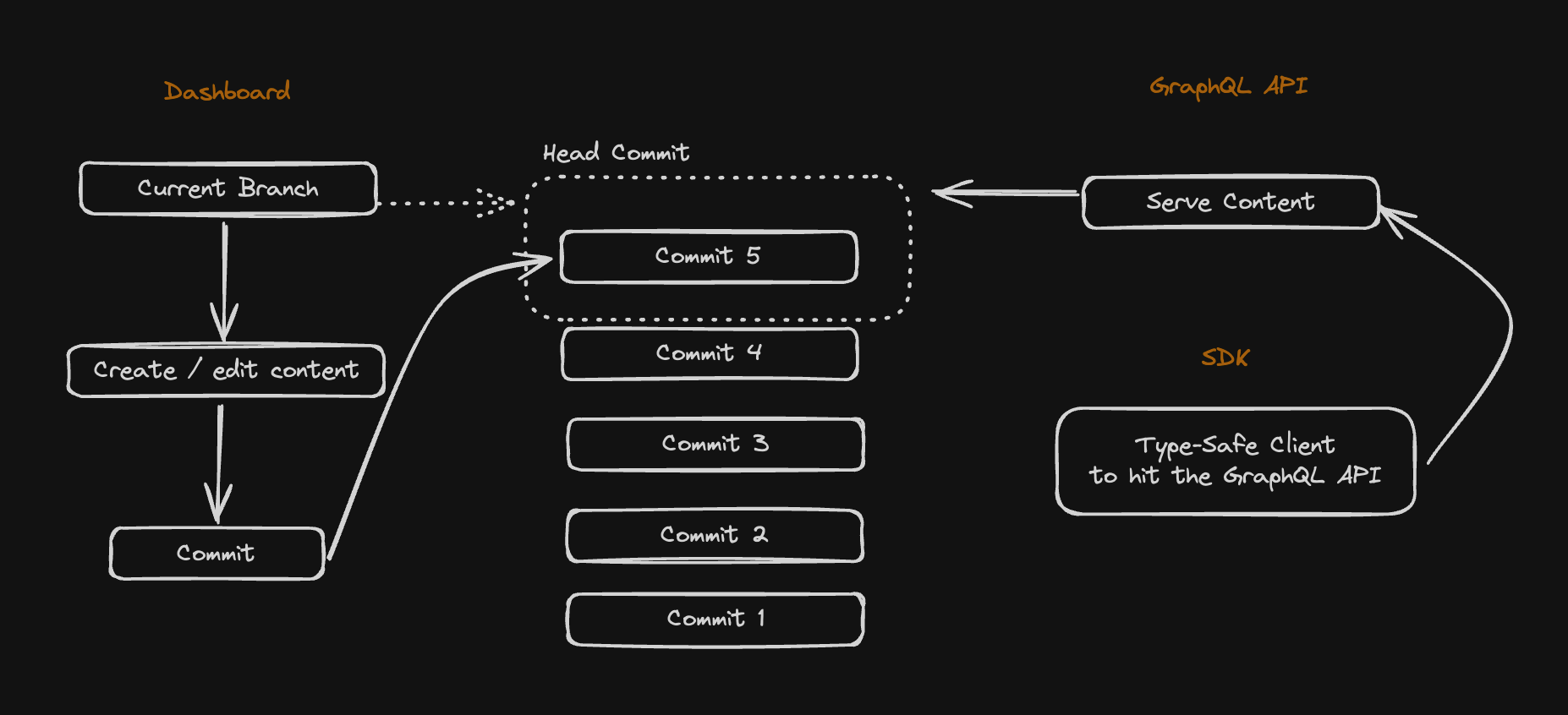
BaseHub has three main properties:
The Dashboard,
basehub.com, where you create teams, repositories, collaborate on content, etcThe GraphQ: API,
api.basehub.com, where you interact with your repository programmatically, either to query data in your repo, or to mutate data in your repoThe SDK, which you install and run within your website:
pnpm i basehub
As you use BaseHub, you—or your team as a whole—will interact with all of these parts, and that’s why having a good understanding of the whole is important.
Creating a Block
Every piece of content you create in BaseHub is a Block. Similar to Lego, Blocks can have different types and functions. You can nest Blocks, reference Blocks, and more.
In the Editor, you’ll create Blocks by typing / and choosing one Block type from the Block selector.
Read more about Blocks in our Blocks Reference:
Committing
A Commit stores a snapshot of your Repo at that specific point in time. Inspired by Git, each commit is immutable, and it’s a core of how version control works in BaseHub.
Once you’re happy with your changes, you can create a Commit. The API will now use the latest commit (the Head Commit) to resolve your queries.
Exploring the GraphQL API
A great way to explore the GraphQL API is to use the Explorer. You can find it in the Developers Tab:

Start Here
Learn how to integrate your Next.js App with BaseHub in a couple of steps.
Set Up basehub
Our official JavaScript/TypeScript library exposes a CLI generator that, when run, will generate a type-safe GraphQL client. Check out our API Reference for more information.
Install1
Install with your preferred package manager.
npm i basehubAdd the BASEHUB_TOKEN Environment Variable2
Get it from your BaseHub Repo’s “Connect to Your App” tab.
BASEHUB_TOKEN="<your-token>"

# Remember to also add this ^ env var in your deployment platform
Configure Node Scripts3
In order to generate the BaseHub SDK, we recommend running basehub dev in parallel to running the development server, and basehub right before building the app.
"scripts": {
  "dev": "basehub dev & next dev",
  "build": "basehub && next build",
  "start": "next start",
  "lint": "next lint"
},Using Windows? You might need to use something like concurrently instead of using the & to run a parallel node process. So:
concurrently \”basehub dev\” \”next dev\”
Start the Dev Server4
Give it a go to make sure the set up went correctly.
npm run devNow, let’s go ahead and query some content!
Your First Query
The recommended way to query content from BaseHub is with <Pump />, a React Server Component that enables a Fast Refresh-like experience.
import { Pump } from "basehub/react-pump"

const Page = () => {
  return (
    <Pump queries={[{ _sys: { id: true } }]}>
      {async ([data]) => {
        "use server"

        return (
          <pre>
            <code>{JSON.stringify(data, null, 2)}</code>
          </pre>
        )
      }}
    </Pump>
  )
}

export default Page
Notice we’re using Next.js’ draftMode and passing it down to Pump. You’ll learn more in the next section, but put briefly: when draft === true, Pump will subscribe to changes in real time from your Repo, and so keep your UI up-to-date. This is ideal for previewing content before pushing it to production. When draft === false, Pump will hit the Query API directly.
Querying Basics
Learn how to build GraphQL queries with the generated client.
When you run basehub, you’ll be generating a GraphQL Client. What’s unique about this GraphQL client is that you’ll be defining the queries within your .{js,ts} files, instead of within .graphql ones. Most importantly, the output of your queries will be fully type safe.
Under the hood, we use https://genql.dev/, so make sure you check out that project out. If you want to see how a GraphQL query converts to a GenQL query, you can check out their converter tool.
basehub()
This function let’s you fire off a single, direct query. Because of this, it’s perfect for querying content that you don’t need to render, like when defining generateStaticParams within a dynamic Next.js page.
import { basehub } from "basehub"

export const generateStaticParams = async () => {
  const { posts } = await basehub().query({
    posts: { items: { _slug: true } },
  })

  return posts.items.map((p) => {
    return { slug: p._slug }
  })
}
<Pump />
Pump can subscribe to realtime changes from your dashboard, and re-compute the JSX so that you can have a Fast Refresh-like experience. Because of this, Pump is ideal for querying content that you’ll want to render—for example, titles, images, rich texts, etc.
import { Pump } from "basehub/react-pump"
import { draftMode } from "next/headers"

const Page = async () => {
  return (
    <Pump queries={[{ _sys: { id: true } }]}>
      {async ([data]) => {
        "use server"

        return (
          <pre>
            <code>{JSON.stringify(data, null, 2)}</code>
          </pre>
        )
      }}
    </Pump>
  )
}

export default PageUnder the hood, Pump uses basehub() as its client. You can think of Pump is an abstraction over the more primitive basehub(), that helps you get that realtime editing experience.
With these two ways of querying in mind, let’s explore how to build our queries.
Anatomy of a Query
Queries are JavaScript objects, where each key represents a key in the GraphQL schema, and the value is a boolean which decides weather you want to retrieve that key or not. Let’s take this query as an example:
import { basehub } from "basehub"

basehub().query({
  _sys: {
    id: true,
  },
  homepage: {
    title: true,
  },
  posts: {
    items: {
      _id: true,
      _slug: true,
      _title: true,
      publishedAt: true,
    },
  },
})
This query above will return the following result:
query {
  _sys {
    id
  }
  homepage {
    title
  }
  posts {
    items {
      _id
      _slug
      _title
      publishedAt
    }
  }
}As you can see, GraphQL and TypeScript are not that different, and this is what our client is taking advantage of.
Passing arguments
You can pass down arguments with __args:
import { basehub } from "basehub"

basehub().query({
  posts: {
    __args: {
      filter: {
        _sys_slug: { eq: "my-post-slug" },
      },
    },
    items: {
      _id: true,
      _slug: true,
      _title: true,
      publishedAt: true,
    },
  },
})
Fragmenting
Fragments are very useful to define data dependencies inside your application. To define a fragment with our SDK, you’ll use fragmentOn:
import { basehub, fragmentOn } from "basehub"

export const PostFragment = fragmentOn("PostItem", {
  _id: true,
  _slug: true,
  _title: true,
  publishedAt: true,
})

// you can use it as a type as well
export type PostFragment = fragmentOn.infer<typeof PostFragment>

basehub().query({
  posts: {
    __args: {
      filter: {
        _sys_slug: { eq: "my-post-slug" },
      },
    },
    items: {
      _id: true,
      _slug: true,
      _title: true,
      publishedAt: true,
      ...PostFragment
    },
  },
})
Co-Locating Components with Their Data Dependency
A common pattern we enjoy using revolves around components defining thier own data dependencies. This works great with fragments, as we can easily define a fragment alongside a component and have it all be type safe.
// Let's imagine a Callout component:

import { fragmentOn } from "basehub"
import { RichText } from "basehub/react-rich-text"

export const CalloutFragment = fragmentOn("CalloutComponent", {
  _id: true,
  emoji: true,
  body: { json: { content: true } },
})

export const Callout = ({
  data,
}: {
  data: fragmentOn.infer<typeof CalloutFragment>
}) => {
  return (
    <div>
      <span>{data.emoji}</span>
      <RichText>{data.body.json.content}</RichText>
    </div>
  )
}
Then you could use this CalloutFragment paired with <Callout /> , all type safe and with the data dependency co-located. If you update your Callout component and require more data from BaseHub, you can update the fragment and you’ll instantly get the data coming via props.
Not Supported: Aliases
Aliases are a very useful GraphQL feature, which unfortunately is not currently supported. If you need this feature, contact us to help us prioritize.
Rendering Rich Text
Fragments let you construct sets of fields, and then include them in queries where you need to.
The GraphQL API can return your Rich Text Blocks’ data in multiple formats:
Plain Text, will ignore all formatting, media, and custom components, easy to render.
HTML, will ignore custom components, easy to render.
Markdown, will ignore custom components, needs a markdown to HTML parser to render.
JSON, comes with everything, but needs something that understand and processes it.
In the case of the JSON format, the response will be an AST based on the TipTap editor spec. Because of the complexities associated with processing this JSON format, we’ve built a React Component called <RichText /> that will help us render our Rich Text content. This is how it works:
import { Pump } from "basehub/react-pump"
import { RichText } from "basehub/react-rich-text"

const Page = async () => {
  return (
    <Pump
      queries={[
        {
          homepage: {
            subtitle: {
              json: {
                content: true,
              },
            },
          },
        },
      ]}
    >
      {async ([{ homepage }]) => {
        "use server"
        return <RichText>{homepage.subtitle.json.content}</RichText>
      }}
    </Pump>
  )
}

export default Page
Component Overrides
When using the <RichText /> component, you can simply pass the JSON content into it via children, and it’ll get rendered. If you want to use a custom handler for a certain HTML node (imagine using Next.js’ <Image /> to render images), you’d use the components prop.
import { Pump } from "basehub/react-pump"
import { RichText } from "basehub/react-rich-text"
import Image from "next/image"

const Page = async () => {
  return (
    <Pump
      queries={[
        {
          homepage: {
            subtitle: {
              json: {
                content: true,
              },
            },
          },
        },
      ]}
    >
      {async ([{ homepage }]) => {
        "use server"
        return (
          <RichText
            components={{
              img: (props) => <Image {...props} />,
            }}
          >
            {homepage.subtitle.json.content}
          </RichText>
        )
      }}
    </Pump>
  )
}

export default Page<RichText /> will return the HTML for each node of content, without any <div> wrapping everything nor any styles. We recommend using something like Tailwind Typography for quick prose styling, or of course, writing your own CSS.
Custom Components
If you are using Custom Blocks in your Rich Text, you’ll need to add them to your query, and pass them via the blocks prop. Then, you’ll be able to set up the custom renderers for them (in a type-safe manner, by the way):
import { Pump } from "basehub/react-pump"
import { RichText } from "basehub/react-rich-text"
import Image from "next/image"
import { Callout, CodeSnippet } from './path-to/components'

const Page = async () => {
  return (
    <Pump
      queries={[
        {
          homepage: {
            subtitle: {
              json: {
                content: true,
                blocks: {
                  __typename: true,
                  on_CalloutComponent: {
                    _id: true,
                    intent: true,
                    text: true,
                  },
                  on_CodeSnippetComponent: {
                    _id: true,
                    code: {
                      code: true,
                      language: true,
                    },
                    fileName: true,
                  },
                }
              }
            },
          },
        },
      ]}
    >
      {async ([{ homepage }]) => {
        "use server"
        return (
          <RichText
            blocks={homepage.subtitle.json.blocks}
            components={{
              img: (props) => <Image {...props} />,
              CalloutComponent: (props) => <Callout data={props}>,
              CodeSnippetComponent: (props) => <CodeSnippet data={props}>,
            }}
          >
            {homepage.subtitle.json.content}
          </RichText>
        )
      }}
    </Pump>
  )
}

export default Page
We hope this removes a bit of friction from the sill tough task of rendering Rich Text data.
Internal Links
Similar to external hyperlinks, internal links in your rich text let you reference other blocks in an easy and type-safe manner.
import { Pump } from "basehub/react-pump"
import { RichText } from "basehub/react-rich-text"
import Image from "next/image"

const Page = async () => {
  return (
    <Pump
      queries={[
        {
          homepage: {
            subtitle: {
              json: {
                content: true,
                blocks: {
                  __typename: true,
                  on_PostComponent: {
                    _slug: true,
                  },
                },
              },
            },
          },
        },
      ]}
    >
      {async ([{ homepage }]) => {
        "use server"
        return (
          <RichText
            blocks={homepage.subtitle.json.blocks}
            components={{
              img: (props) => <Image {...props} />,
              a: ({ internal, ...props }) => {
                if (internal) {
                  switch (internal.__typename) {
                    case "PostComponent":
                      return (
                        <a {...props} href={`/blog/${internal._slug}`} />
                      )
                    default:
                      return null
                  }
                } else return <a {...props} />
              },
            }}
          >
            {homepage.subtitle.json.content}
          </RichText>
        )
      }}
    </Pump>
  )
}

export default Page
Environments & Caching
Understand the different environments and caching strategies you can leverage to improve your content editing experience.
Environments
Setting up your application so that it handles all of the environments in a seamless fashion is a very important part of integrating with BaseHub.
Local Environment
When developing in localhost, you’ll be writing new code and iterating over your content. This means adding new blocks, changing those blocks’ constraints, writing content and more—all at the same time.
In order to not break your flow, you’ll want two things:
For the schema in BaseHub to be in sync with your IDE, and
For the content to update as you write, without needing to commit it yet.
We bundled these two needs into one command:
basehub devThis command generates the type-safe SDK and keeps it in sync with changes you make in basehub.com (this is called --watch mode); and also sets up the SDK so that it queries Draft content from your repository.
This is why we recommend you run it in parallel to next dev.
"scripts": {
  "dev": "basehub dev & next dev",
  "build": "basehub && next build",
  "start": "next start",
  "lint": "next lint"
},
Notice the single &.
Preview Environment
Setting up an easy way for editors to preview content before committing it into production is essential. We’ve designed our preview workflow with these three pillars in mind:
Content should render in real time, as you write.
Preview should be easy for developers to integrate.
The integration should never degrade production performance in any way.
We achieve this is by using a couple of BaseHub components, <Pump /> and <Toolbar />, in combination to Next.js’ draftMode. Additionally, to bridge the gap between basehub.com (the dashboard) and your website, you’ll need to set up the “Preview” Button.
This is how a simple code example can look like:
import { Toolbar } from 'basehub/next-toolbar'

export default function RootLayout({
  children,
}: { children: React.ReactNode }) {
  return (
    <html lang="en">
      <body>
        {/* Layout UI */}
        <main>{children}</main>
        <Toolbar />
      </body>
    </html>
  )
}Finally, we need to set up our Preview Buttons.
Production Environment
Once we’ve set up Local and Preview environments, most of the hard work is done. The only thing you need to make sure when going to production is for the SDK to be generated before the build step of your application.
"scripts": {
"dev": "basehub dev & next dev",
"build": "basehub && next build",
"start": "next start",
"lint": "next lint"
},That should be it. You’re ready to deploy your website.
Using Turborepo or a similar monorepo manager? You need to add .basehub to turbo.json's build outputs, so it can keep track of schema changes.
"tasks": {
"build": {
"outputs": [".basehub/**"]
},
}Caching
By default, Next.js will try to cache all of our requests made with fetch—and that includes BaseHub. While this makes subsequent requests to BaseHub much faster, it’ll essentially make your website’s content fully static, instead of reflecting the latest content changes from your BaseHub Repo.
This introduces a new task for the developer, which is to purge that cache when content from BaseHub changes. These are some of the options you have:
On-Demand Revalidation (Recommended)
The absolute best method of revalidation is “on-demand”. As its name implies, it consists of purging the cached data at the exact moment a change occurs. This provides the best experience for editors, as they won’t need to refresh the website for several seconds to see their content live; and also keeps server costs down, as the server itself won’t need to constantly check with our API to see if something has changed.
BaseHub provides automatic on-demand revalidation in a fine-grained manner.
Automatic: without the need of constant developer setup.
Fine-grained: with every query being revalidated individually—in contrast to an “all or nothing” approach.
This is how:
Mount the <Toolbar /> in layout.tsx1
This will add a Server Action to revalidate the specific tags basehub() will set to each query.
// app/layout.tsx
import { Toolbar } from "basehub/next-toolbar"
export default function RootLayout({
children,
}: {
children: React.ReactNode
}) {
return (
<html lang="en">
<body>
{/* Layout UI */}
<main>{children}</main>
<Toolbar />
</body>
</html>
)
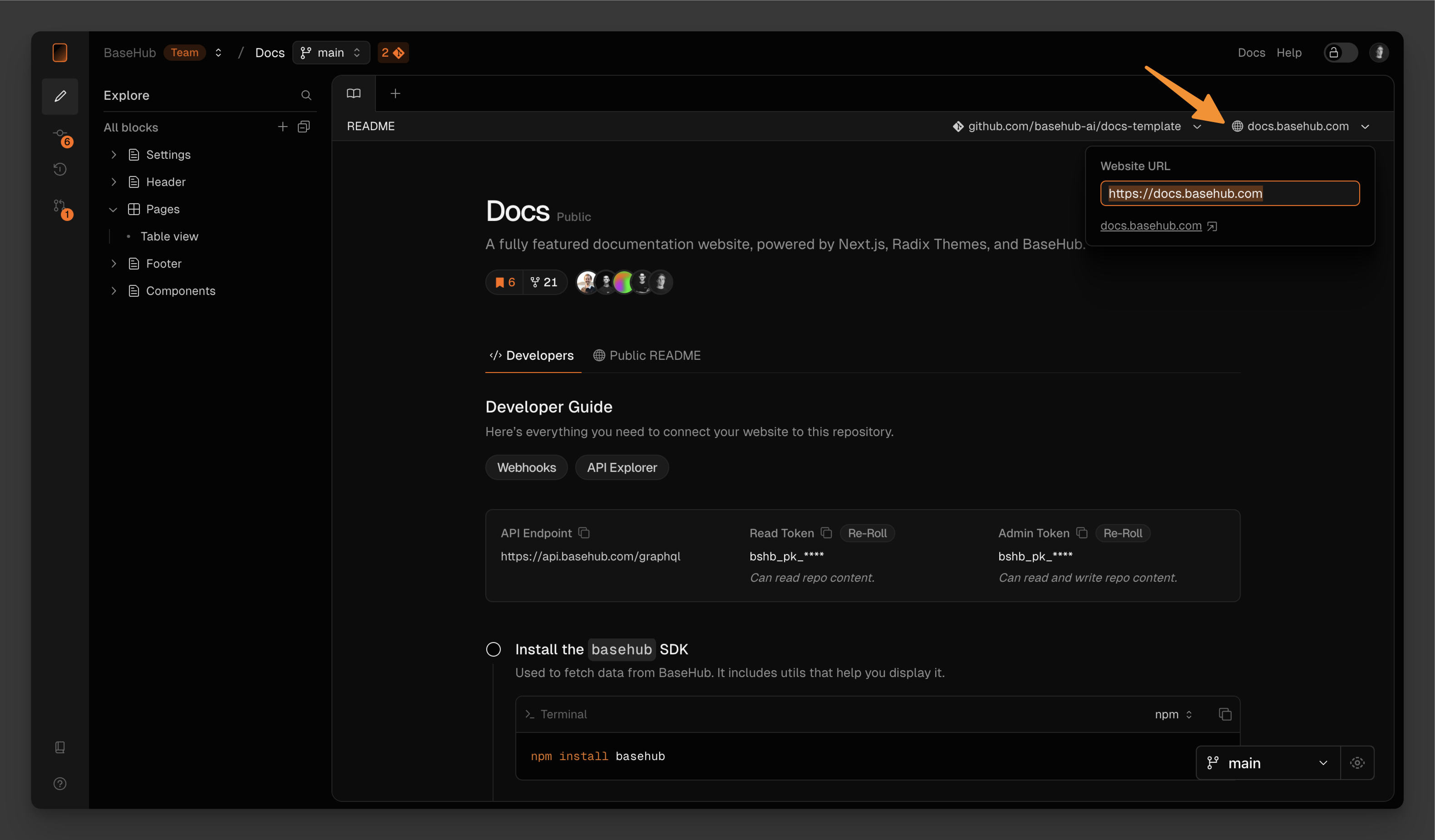
}Fill in the Website URL input in BaseHub2
This will help our servers know where to go to to revalidate the queries.
Just use it3
That should be all! Make sure you don’t pass other cache-related props (such as revalidate or cache), as that will opt the query out of automatic on-demand revalidation.
As you may notice, we’re also not passing draftMode().isEnabled via props, as this is no longer required as of basehub@7.5.10—we now automatically infer draft mode for you.
import { Pump } from "basehub/react-pump"
import { basehub } from "basehub"
const Page = async () => {
// works with basehub and with Pump
const data = await basehub().query({ __typename: true })
return (
<Pump queries={[{ __typename: true }]}>
{async ([data]) => {
"use server"
return <pre>{JSON.stringify(data, null, 2)}</pre>
}}
</Pump>
)
}
export default PageWondering how does this all work? When basehub().query is ran, we hash the query being sent and use it as a cache tag. We send this cache tag to our servers (alongside the query itself).
The server now runs the query and computes the response. It will then hash the response, and store the cache tag, the original query, and the response hash in our database.
On commit, we’ll get all of the queries we’ve been collecting and run them again against the newly committed tree of blocks. Now, one by one, we run them, compute the response hash, and compare it against the one we previously returned to the user. If response hashes don’t match, we need to revalidate the query.
To revalidate the query, we spin up a headless browser that navigates to your Website URL and executes the Server Action our <Toolbar /> created.
Read the full writeup in our blog to learn more.
Time-Based Revalidation
Another conventional way to revalidate content is to use Next.js’ time-based revalidate caching option.
import { Pump } from "basehub/react-pump"
const Page = async () => {
return (
<Pump
next={{ revalidate: 30 }}
queries={[{ __typename: true }]}
>
{async ([data]) => {
"use server"
// `data` will be stale after 30 seconds
return <pre>{JSON.stringify(data, null, 2)}</pre>
}}
</Pump>
)
}
export default PageWhile this is very easy to set up, automatic on-demand revalidation is always better, as editors won’t need to refresh the website for several seconds to see their content live; will keep server costs down, as the server itself won’t need to constantly check with our API to see if something has changed; and will simply remove one task from developers’ hands.
MCP
You can use your agent tools provided by our MCP server and connect it to your favorite apps, like Claude and Cursor.
The MCP (Model Context Protocol) integration enables AI agents to interact directly with your BaseHub repository through a comprehensive set of tools. From creating and updating content blocks to managing assets and automating workflows, you can build functional websites, migrate hardcoded content, and set up forms—all through natural language prompts with your favorite AI tools.
“MCP is an open protocol that standardizes how applications provide context to LLMs. Think of MCP like a USB-C port for AI applications. Just as USB-C provides a standardized way to connect your devices to various peripherals and accessories, MCP provides a standardized way to connect AI models to different data sources and tools.”
How to integrate
Prerequsities1
To use the BaseHub MCP, you should have Cursor installed in your machine before integrating it.
Go to “Connect” tab in your dashboard2
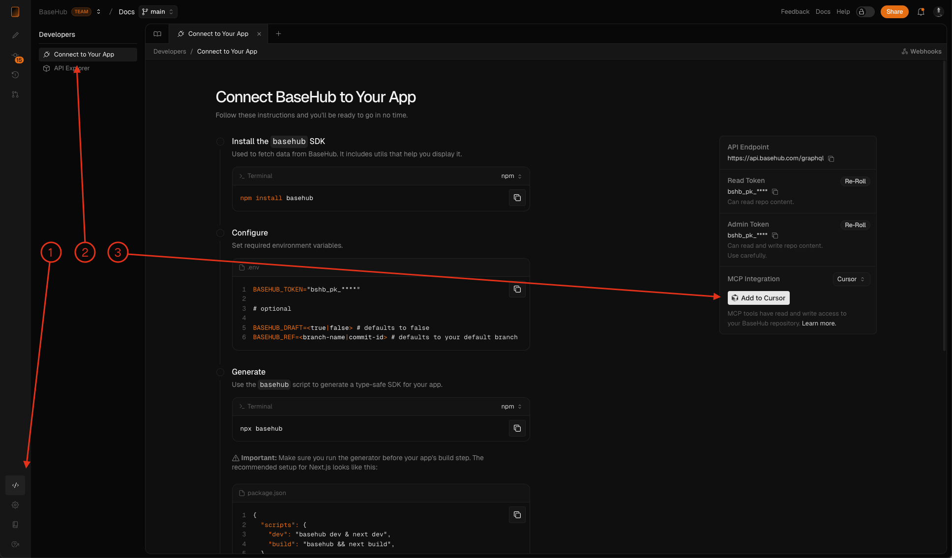
Click on “Add to Cursor”3
The flow will ask you to open the “Cursor” app. After opening, it will show this config form.
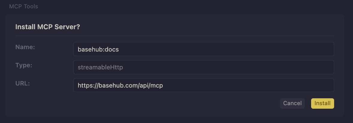
Finish your set-up4
Rename the MCP server if you need and click “Install”. You’re ready to start building with Cursor + BaseHub. NOTE: Make sure to use Agent mode to let Cursor use BaseHub tools.
In the background, this button adds the BaseHub MCP server URL to your Cursor config with a special BaseHub MCP Token that is linked to your user in BaseHub. This token gives read and write access to the LLM and saves the current ref where the LLM will work (main by default).
To set it up in Claude desktop, you should copy and paste the BaseHub MCP token by yourself.
Available tools
Use cases
Start from scratch, create a fresh new website.
You can have a functional website in minutes with a good prompt and the help of BaseHub tools.
Un-hardcode an existing piece of content from your site.
Incrementally implementing your content into the CMS has never been easier, push hardcoded content into BaseHub with just one prompt.
Upload local images/videos/3D-models to your CMS.
The MCP supports asset uploading and lets the LLM know which steps to take to easily upload local files to BaseHub CDN
Set up a newsletter form (or any kind of form) without writing a single line of code.
Simplify your integrations with LLMs work and BaseHub API transaction capabilities.
Agents
BaseHub Agents are AI assistants that help with content management, automated workflows, and team collaboration.
START
It comes preconfigured with:
An extensive system prompt optimized for BaseHub workflows and content operations
All available tools enabled, including content editing, users data, and web access
Deep integration with BaseHub's ecosystem, understanding your content structure and relationships

Comments
You will see START in the users list when typing @ in your comments. You can use @START to include the agent in the conversation. Agents in comments have contextual awareness, they will know on which block the comment is and the previous conversation in the thread, just like another user!

Agents
BaseHub Agents (currently in free beta) are AI companions that can be customized through your dashboard to help with content management, automated workflows, and team collaboration. Whether you need contextual assistance in comments, automated content updates, or external integrations with platforms like Slack and Claude, agents can be tailored to your specific needs and workflows.
External usage
Embed chat
You can embed your chat in any application with a simple snippet provided in the connect instructions above your agent tab.
import Script from 'next/script'
import { basehub } from 'basehub'
import '../basehub.config'
export default async function RootLayout({
children,
}: Readonly<{ children: React.ReactNode }>) {
const data = await basehub().query({
_agents: {
docsAi: {
embedUrl: true,
},
},
})
return (
<html lang="en" suppressHydrationWarning>
<body className={`${GeistSans.variable} ${GeistMono.variable} font-sans`}>
<ThemeProvider>
<Header />
{children}
<Footer />
</ThemeProvider>
<Toolbar />
<Script src={data._agents.docsAi.embedUrl} />
</body>
</html>
)
}
Slack bot
Chat with this Agent in your Slack workspace by following the instructions in the Connect section.
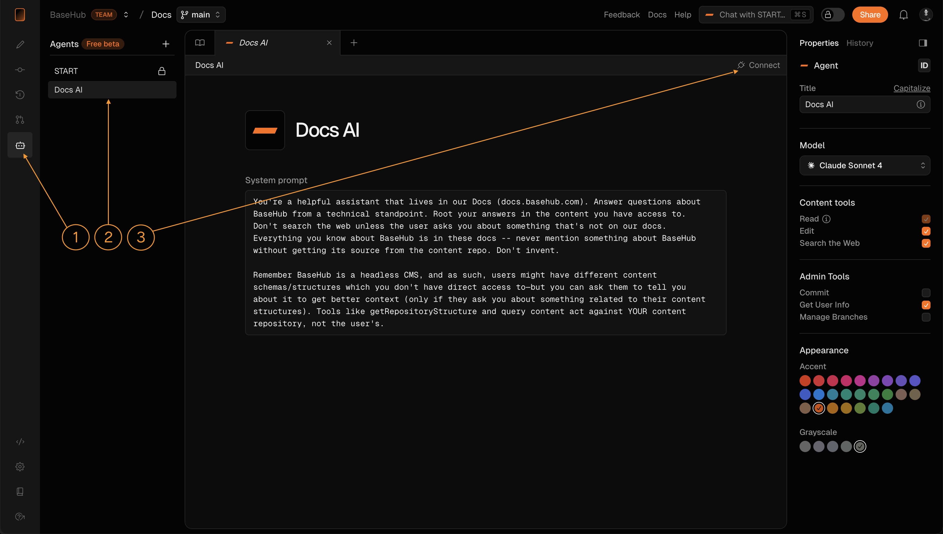
Customize your agent
You can customize the visuals from your agent: name, description, avatar, colors.These will be consumed to create the embed chat bubble and messages style.
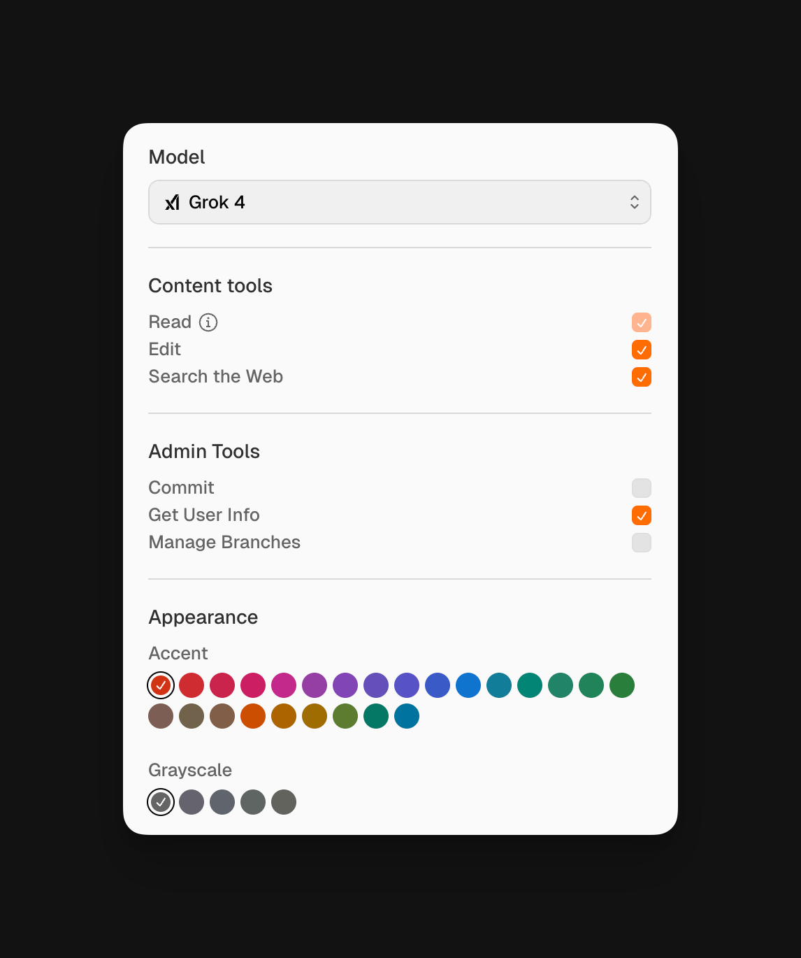
Pricing and Limitations
BaseHub Agents are currently available in free beta with full access to all features. As the platform evolves, we may introduce pricing tiers for advanced AI models and implement rate limits for external API calls to agents. Workflow automations will remain unaffected by any future limitations, ensuring your internal processes continue running smoothly.
Workflows
Automate content generation across your repository with AI-powered workflows.
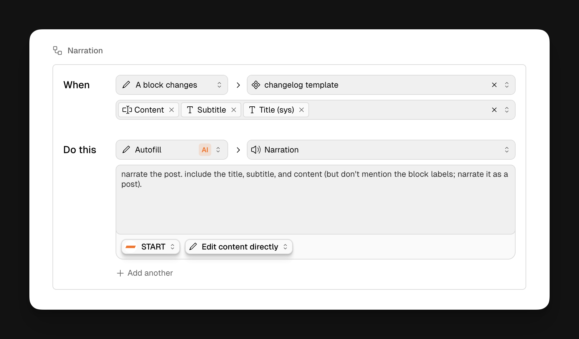
You can trigger automated content updates with contextual prompts to let the AI agent know what to do when the workflow runs.
Trigger
Use the "A block changes" trigger to run a workflow whenever a selected block is updated.
Action
There are two types of actions your workflow can perform:
AI Autofill: Automatically generate or update a block’s content.
Apply Variant: Apply a predefined variant to a block.
Get started
To get started, go anywhere in your Editor and add a new Workflow Block typing: /workflow
How to configure
Prerequisites1
You’ll need:
At least one existing block to act as a trigger.
A target block where the generated content will go.
Set the Trigger Type2
In your workflow block, set the trigger to: A block changes
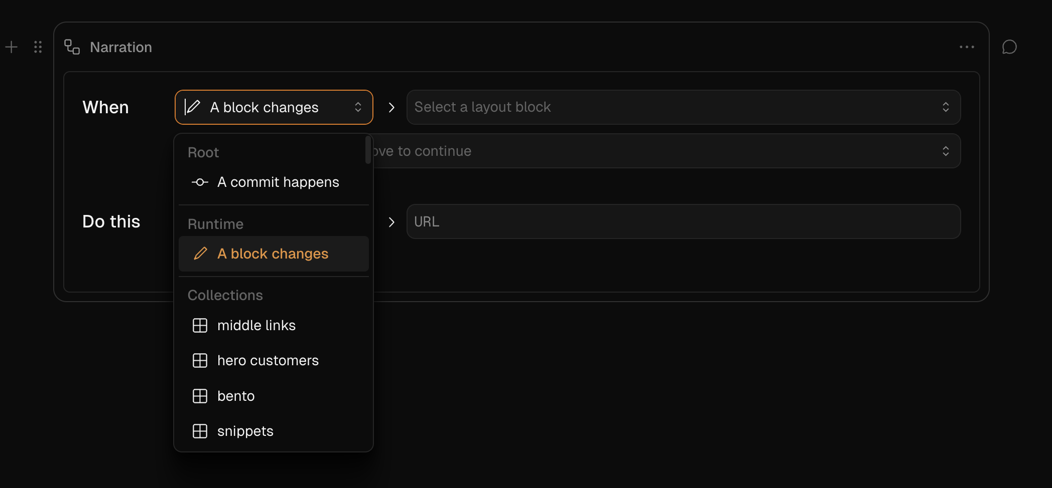
Select Trigger blocks3
Choose the blocks that will activate the workflow when they change.
You’ll configure two selectors:
One for the layout block.
Another for the child blocks that will act as triggers.
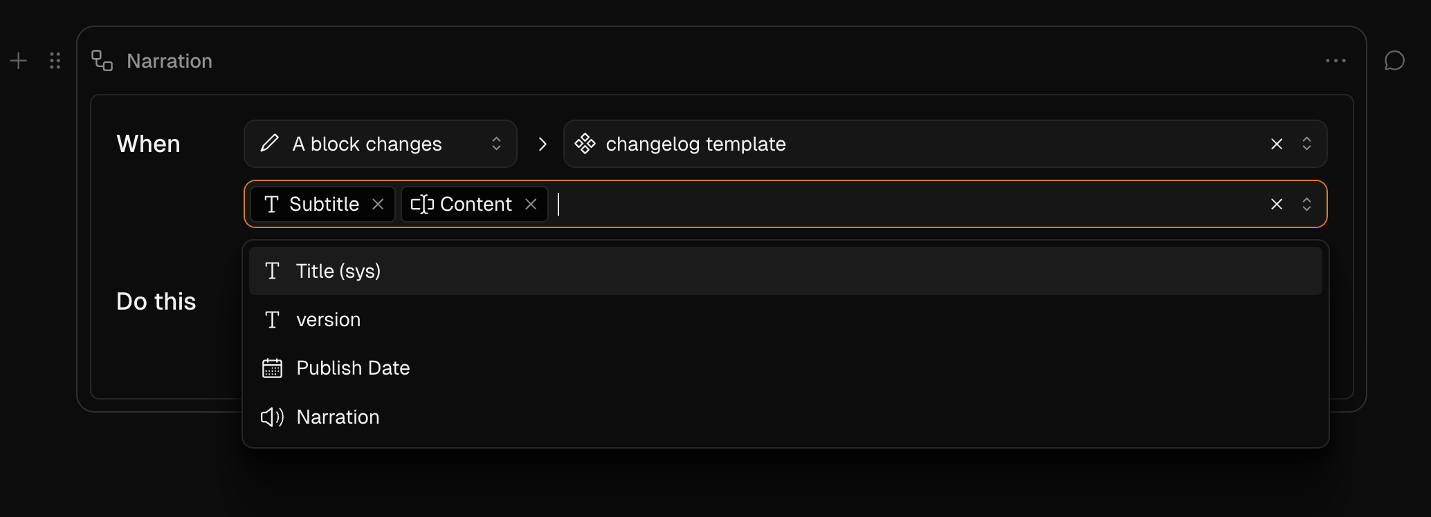
Important: If you select a component, the trigger will also apply to all of its instances. This means you can set up a trigger in a list template and have the workflow generate content across all rows in that list.
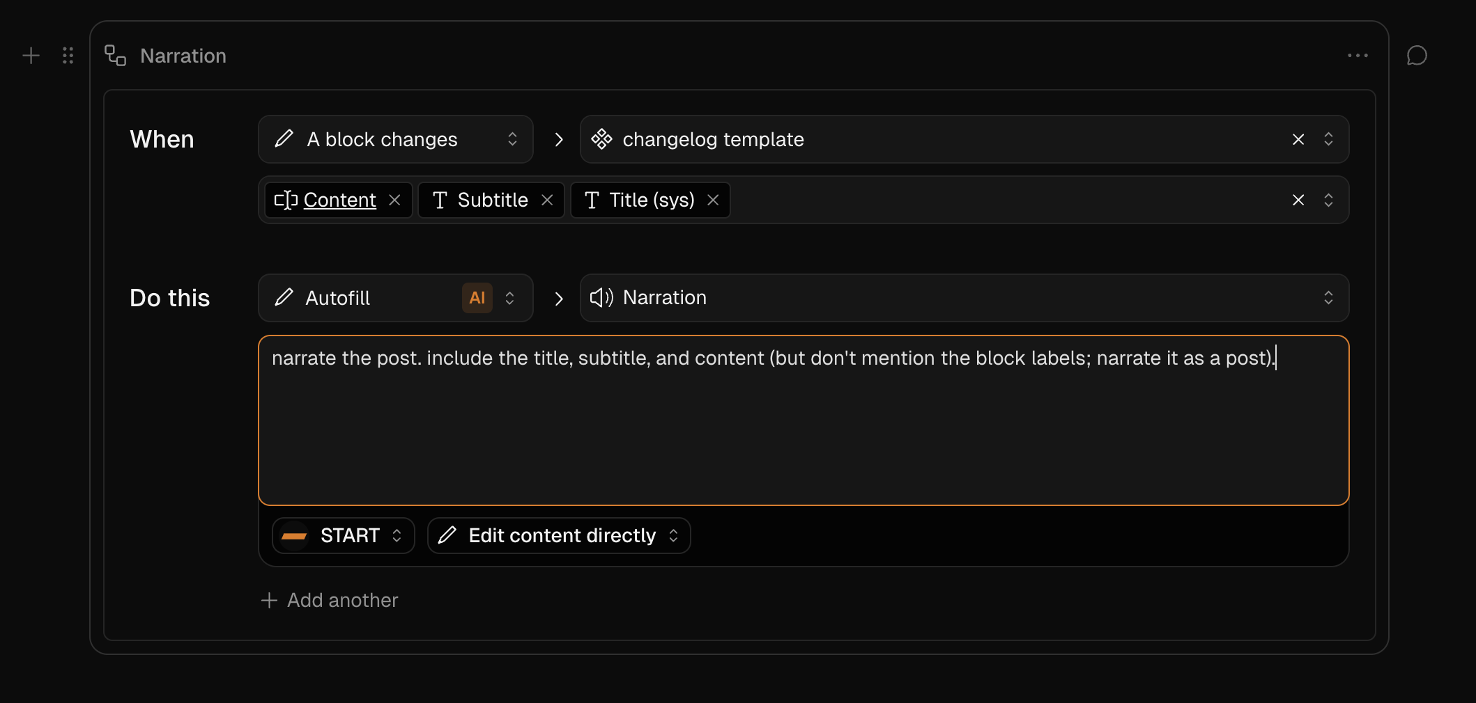
Define the Action4
Choose the action type: AI Autofill / Apply Variant
Then select the target block where the generated content will be applied. The target block can only be a child of the selected layout block.
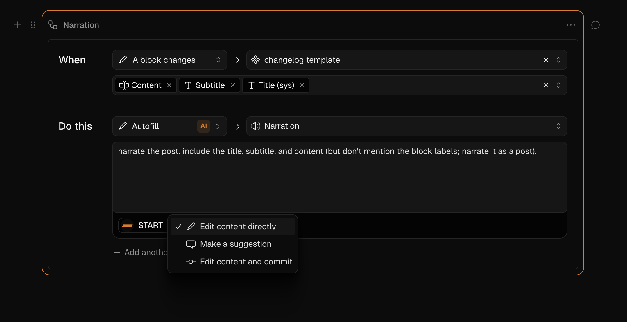
Leave instructions for START5
Prompt your AI agent with directives, and let them know if you want the content to be applied:
As draft changes.
In a content suggestion.
In a new commit.
Monitor Workflow Runs6
When a workflow is triggered, the target block will show a badge with the status in its label.
You can also track real-time workflow activity in the Runs section of the workflow block’s properties panel. Here, you can:
See the current status
Prevent, cancel, or retry workflow generations

Use cases
Localize Docs or Product Pages
You can create a workflow to automatically translate the content of posts immediately after they change.
Summarize Longform Content
Automatically generate a summary every time an article, doc, or changelog post is updated.
Generate Audio Narrations
Transform written content into audio.
Search
Learn how to add instant-search into your website.
BaseHub Search will help you create instant-search experiences ala Algolia inside your website. There are two steps into building an awesome search experience:
Indexing the content
Building the frontend
BaseHub helps you with both of these tasks.
Indexing the Content
BaseHub Search supports indexing blocks that are below Components. By default, blocks won’t be indexed. To index a block, you’ll go to over to its Properties Panel and click on the “Index block“ toggle.
The “Index block” state is set in a Component, and will be inherited by the Instances. Make sure you go to a Component to toggle this state.
Indexing Happens On Commit
In order for results to appear on your frontend, you’ll need to commit your changes. Toggling the “Index block” state is a “committable change.” Then, as you edit and add new content content, and commit, BaseHub Search will re-index and then your frontend will show the updated results.
Building the Frontend
There are a couple of ways in which BaseHub helps you build your search frontend. First, you’ll needit exposes a useSearch hook to make the queries and manage state. Second, it exposes a <SearchBox> component that provides good UX defaults for you to render your search input, your results, and your highlights.
In order for all of this to work, you’ll first need to get a _searchKey from the GraphQL API, which is scoped to a specific Collection or Component.
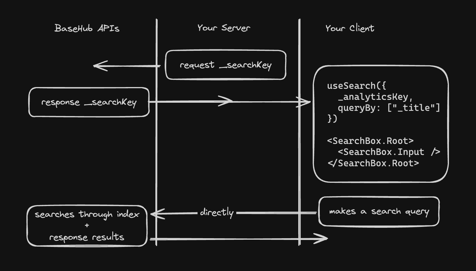
Let’s imagine you have a Posts Collection and you want to build a frontend so search through it.
Get a _searchKey1
This is how you’ll get your _searcKey:
import { Pump } from "basehub/react-pump"
import { draftMode } from "next/headers"
const Page = async () => {
return (
<Pump
next={{ revalidate: 30 }}
draft={draftMode().isEnabled}
queries={[
{
posts: {
_searchKey: true,
items: {
_id: true,
_title: true,
// more post stuff...
},
},
},
]}
>
{async ([data]) => {
"use server"
return (
<>
<Search _searchKey={data.posts._searchKey} />
...
</>
)
}}
</Pump>
)
}
export default PageBuild your <Search> component2
You’re now ready to useSearch and <SearchBox> to build your UI.
'use client'
import { useSearch, SearchBox } from "basehub/react-search"
export const Search = ({
_searchKey,
}: {
_searchKey: string
}) => {
const search = useSearch({
_searchKey,
queryBy: ["_title", "body", "excerpt"],
})
return (
<SearchBox.Root search={search}>
<SearchBox.Input />
<SearchBox.Placeholder>
Start typing to search.
</SearchBox.Placeholder>
<SearchBox.Empty>
Nothing found for <b>{search.query}</b>
</SearchBox.Empty>
<SearchBox.HitList>
{search.result?.hits.map((hit) => {
return (
<SearchBox.HitItem
key={hit._key}
hit={hit}
href={`/blog/${hit.document._slug}`}
>
<SearchBox.HitSnippet fieldPath="_title" />
<SearchBox.HitSnippet
fieldPath="body"
fallbackFieldPaths={["excerpt"]}
/>
</SearchBox.HitItem>
)
})}
</SearchBox.HitList>
</SearchBox.Root>
)
}Examples
Simple, non real-world example
GitHub Repo: https://github.com/basehub-ai/nextjs-simple-search-example
BaseHub Repo: https://basehub.com/basehub/simple-search-example
Advanced example (the search that powers these docs)
GitHub Repo: https://github.com/basehub-ai/nextjs-docs
BaseHub Repo: https://basehub.com/basehub/docs
Analytics
Learn how to send analytics events from your website.
BaseHub’s Event Block provides a powerful way to know more about how your content is performing. The unique thing about it is that Events that occur throughout your website can be tied directly to a Block—therefore keeping it in context.
While this article focuses on analytics, the Event block is versatile and offers much more functionality, including two different layouts and multiple use cases. For a more complex use case, check out Forms.
The Event Block time-series can be used for tracking things like:
Page views (internal and user facing)
Button/Link Clicks
Feedback forms
Or anything you want, really.
Set up an Event Block and start receiving events
First of all, you’ll need to add a new Event Block to your repo.
Create a new event block
Switch to Time-series layout
Commit your changes (not necessary if you’re working on draft mode)
Get your event’s
ingestKey
ingestKey vs adminKey
Keep in mind that the Event block exposes two different keys for different type of actions.
Since sending data is the most common, and at the same time the most safe, action in events, it has a distinctive ingestKey that can be safely used client side.
On the other side, update and read access is reserved for the adminKey and could be the case that the data stored being sensitive enough to protect that key and only use it server-side.
Send an Event
In order to send an event, you’ll need to first get the ingestKey of an Event Block from the GraphQL API. Let's look at an example that tracks page views on the homepage. Once we get the page data and its ingestKey, we’ll import { sendEvent } from "basehub/events" and run it on mount:
import { Pump } from "basehub/react-pump"
import { draftMode } from "next/headers"
const Homepage = () => {
return (
<Pump
next={{ revalidate: 30 }}
draft={draftMode().isEnabled}
queries={[
{
homepage: {
_title: true,
pageViews: {
ingestKey: true,
}
},
},
]}
>
{async ([{ homepage }]) => {
"use server"
return (
<div>
<PageView ingestKey={homepage.pageViews.ingestKey} />
<h1>{homepage._title}</h1>
</div>
)
}}
</Pump>
)
}Get an Event count
In case you want to show the Event Count in your website—for example, to render a “view count”—, well, you can! Following up from the <PageView /> component we built previously, we can update it so that it runs getEvents and renders it:
"use client"
import * as React from "react"
import type { PageViews as PageViewsType } from "~/.basehub/schema"
import { sendEvent, getEvents } from "basehub/events"
export const PageView = ({
ingestKey,
adminKey,
}: {
ingestKey: PageViewsType["ingestKey"],
adminKey: PageViewsType["adminKey"]
}) => {
const [count, setCount] = React.useState()
// On mount, send the event
React.useEffect(() => {
sendEvent({ ingestKey, name: "page_view" })
}, [])
// We also get the event count so we can render it
React.useEffect(() => {
getEvents(key, {
type: 'time-series',
range: 'all-time'
}).then(
(response) => {
if (response.success) {
setCount(response.data)
}
},
)
}, [])
return <div>Views: {count ?? "Loading..."}</div>
}Forms
The powerful Event block lets you build a form schema from the dashboard, and consume it in code to build complex forms.
This article goes over how to build and manage Forms via BaseHub. Take a look at our video guides:
Create an event block and customize your fields
First things first, you’ll need an Event block to start building your form and to have a space where to display users’ submissions. You can create a new block using the slash command in the dashboard.
Handle the incoming schema in code
BaseHub SDK lets you fetch the event block schema and handle each field as you want. Completely headless experience.
Start receiving events
Last but not least, you should set up a form action to link users’ submissions to your Event block in BaseHub’s dashboard.
import { Pump } from "basehub/react-pump"
import { RichText } from "basehub/react-rich-text"
import { parseFormData, sendEvent } from "basehub/events"
export default function Home() {
return (
<Pump
queries={[
{
homepage: {
title: true,
subtitle: {
json: {
content: true,
},
},
submissions: {
ingestKey: true,
schema: true,
},
},
},
]}
>
{async ([{ homepage }]) => {
"use server"
const ingestKey = homepage.submissions.ingestKey
return (
<div className="...">
<main className="flex flex-col gap-8 row-start-2 items-center">
<h1 className="text-3xl sm:text-4xl text-center sm:text-left">
{homepage.title}
</h1>
<div className="text-center sm:text-left">
<RichText
content={homepage.subtitle.json.content}
/>
</div>
<form
className="w-1/2 sm:w-full border rounded-lg p-4 space-y-3"
action={async (formData) => {
"use server"
const parsedSubmission = parseFormData(
ingestKey,
homepage.submissions.schema,
formData,
)
if (!parsedSubmission.success) {
// The `parseFormData` return type lets you
// handle parsing errors. Since this is a simple
// example, we're just throwing an error.
throw new Error(
JSON.stringify(parsedSubmission.errors),
)
}
sendEvent(ingestKey, parsedSubmission.data)
}}
>
{homepage.submissions.schema.map((field) => (
<label
key={field.id}
className="flex gap-x-2"
>
<span>{field.label}</span>
<input
{...field}
className="border rounded-sm"
/>
</label>
))}
<button type="submit">Submit</button>
</form>
</main>
</div>
)
}}
</Pump>
)
}Once this is set up, events will be loaded in real-time in your dashboard.
Extend your forms
Once you have the initial setup, building more complete forms has the same or even less complexity. Here’s how:
Webhooks
Learn how to use Webhooks to subscribe to changes that happen within BaseHub.
Workflows allow you to receive event notifications from BaseHub. BaseHub will send a POST request to a URL you specify when certain events happen in a BaseHub Repository.
Available triggers
A commit happens: This is a useful notification that can help you set up on-demand revalidation for your Next.js Apps, amongst other things.
- Requires the workflow to be committedCollection Events: Row created, updated or deleted.
- Requires the workflow to be committedNew events in Event Block.
- Requires the workflow to be committedA primitive block value, or a layout block title gets updated.
- Does not require the workflow to be committed
Workflow block
To configure webhooks, you’ll need to create a new Workflow block in your repo. There you can setup the URL that will be requested when the workflow is triggered.
Handling Webhook Events on Your API Endpoint
Once you've configured a webhook in your BaseHub project, you’ll want to properly authenticate and process the incoming event on your API endpoint. The basehub/workflows package provides a utility called authenticateWebhook that simplifies this process and returns a typed payload, depending on the trigger used in your workflow.
Below is a full example using Vercel's Edge Functions, but the approach applies to other environments with minor adjustments.
Authenticating and Handling a Webhook
import { basehub } from 'basehub'
import { authenticateWebhook } from 'basehub/workflows'
export const POST = async (request: Request) => {
const {
workflows: {
onDemandRevalidation: { webhookSecret },
},
} = await basehub().query({
workflows: {
onDemandRevalidation: {
webhookSecret: true,
},
},
})
const result = await authenticateWebhook({
body: request.body,
signature: request.headers,
secret: webhookSecret,
})
if (!result.success) {
return new Response('Unauthorized', { status: 401 })
}
// your custom webhook revalidation logic goes here
return new Response(
JSON.stringify({ success: true }),
{
status: 200,
headers: {
'Content-Type': 'application/json',
},
}
)
}
Notes
authenticateWebhookhandles signature validation and payload type-safety for you.The structure of the
result.payloaddepends on the workflow's trigger.Use the payload data to kick off revalidation, background jobs, or sync with external services.
Payload Types by Trigger
Below is a complete list of supported event types and their corresponding payload structures.
commit.created
Triggered when a new commit is created.
{
type: 'commit.created',
timestamp: string,
data: Commit
}list-block.created
list-block.updated
list-block.deleted
Triggered on commit, when a block inside a list is created, updated, or deleted.
{
type: 'list-block.created' | 'list-block.updated' | 'list-block.deleted',
timestamp: string,
data: {
listBlockId: string,
blockId: string
listBlockTitle?: string,
}
}listBlockId: The ID of the list block.blockId: The child block that was created/updated/deleted.listBlockTitle: Optional title of the list block.
event-block.created
Triggered when an event is received.
{
type: 'event-block.created',
timestamp: string,
data: {
eventBlockId: string,
eventBlockTitle: string,
parentBlockId?: string,
data?: any
}
}eventBlockId: ID of the event block.parentBlockId: The parent block (if applicable).data: Arbitrary user-defined data.
block.updated
Triggered when a block is updated.
This event includes only the block ID and its location in the tree.
{
type: 'block.updated',
timestamp: string,
data: {
blockId: string,
blockIdPath: string
}
}blockId: ID of the block.blockIdPath: A string path representation of the block's location in the tree.
Common Use Cases
Once you've set up webhook handling, here are a few things you might use them for:
Revalidate a page in your frontend after committing content.
Send feedback or logs to a Slack or Discord channel.
Trigger third-party services, like uploading videos to a hosting platform.
Webhooks let you connect BaseHub to the rest of your stack—so you can automate what matters and keep your workflows smooth.
Localization
Learn how to add localization, or i18n, by using the Variants Block.
Localization in BaseHub is enabled by the Variant Block.
Create the Variants Block1
Somewhere in the Editor, press “/variants” and add the block. Name it “Language“. Make sure you create this block below a Document block.
Add some langauges inside2
Add some variants for the languages you’ll support.
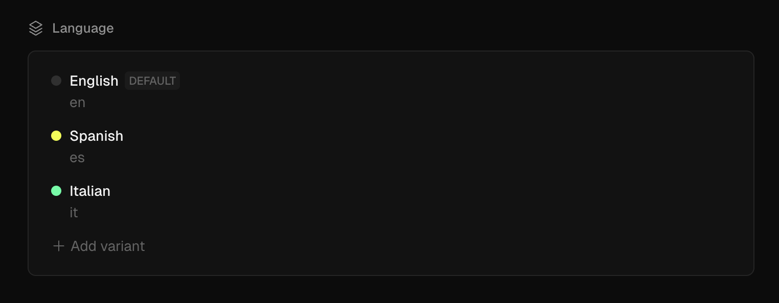
Enable the set on a Document or a Collection3
Take a look at this short video to see how we do it.
Query by variants on GraphQL4
After committing your changes, you will be able to apply variants arguments on the blocks that you enabled it, check it out:
{
# from this point on, the schema will inherit the variant selected
posts(variants: { language: es }) {
items {
_title
excerpt
coverImage {
url
}
body {
json {
content
}
}
}
}
}Note that variant sets can only live inside Documents. Because of their unique nature, they cannot be replicated by Components and instances behaviors.
Full Example
Astro
Get started with Astro and BaseHub.
Astro is a framework for performant, content-driven websites. With it, you can use almost any UI library you want to (React, Vue, Svelte, etc).
The main difference that the setup Astro has vs Next.js is in the way it exposes environment variables.
While in Next.js, process.env.BASEHUB_TOKEN is available for our SDK to use, in Vite-powered frameworks (like Astro), you’ll need to explicitly pass the token via params as you’ll see below.
Set Up basehub
Our official JavaScript/TypeScript library exposes a CLI generator that, when run, will generate a type-safe GraphQL client. Check out our API Reference for more information.
Install1
Install with your preferred package manager.
npm i basehubAdd the BASEHUB_TOKEN Environment Variable2
Get it from your BaseHub Repo’s “Connect to Your App” tab.
BASEHUB_TOKEN="<your-token>"
# Remember to also add this ^ env var in your deployment platformConfigure Node Scripts3
In order to generate the BaseHub SDK, we recommend running basehub dev in parallel to running the development server, and basehub right before building the app.
"scripts": {
"dev": "basehub dev & astro dev",
"start": "basehub dev & astro dev",
"build": "basehub && astro check && astro build",
"preview": "astro preview",
"astro": "astro"
},Start the Dev Server4
Give it a go to make sure the set up went correctly.
npm run devYour First Query
Now, let’s go ahead and query some content!
---
import { basehub } from 'basehub'
const data = await basehub({
token: import.meta.env.BASEHUB_TOKEN
}).query({
__typename: true,
_sys: {
id: true
}
})
---
<html lang="en">
<head>
<meta charset="utf-8" />
<link rel="icon" type="image/svg+xml" href="/favicon.svg" />
<meta name="viewport" content="width=device-width" />
<meta name="generator" content={Astro.generator} />
<title>Astro</title>
</head>
<body>
<pre><code>{JSON.stringify(data, null, 2)}</code></pre>
</body>
</html>Support Table
While you can query BaseHub content from Astro, there are some DX features that are not supported.
SvelteKit
Get started with SvelteKit and BaseHub.
SvelteKit is a framework for rapidly developing robust, performant web applications using Svelte.
The main difference that the setup SvelteKit has vs Next.js is in the way it exposes environment variables.
While in Next.js, process.env.BASEHUB_TOKEN is available for our SDK to use, in Vite-powered frameworks (like SvelteKit), you’ll need to explicitly pass the token via params as you’ll see below.
Set Up basehub
Our official JavaScript/TypeScript library exposes a CLI generator that, when run, will generate a type-safe GraphQL client. Check out our API Reference for more information.
Install1
Install with your preferred package manager.
npm i basehubAdd the BASEHUB_TOKEN Environment Variable2
Get it from your BaseHub Repo’s “Connect to Your App” tab.
BASEHUB_TOKEN="<your-token>"
# Remember to also add this ^ env var in your deployment platformConfigure Node Scripts3
In order to generate the BaseHub SDK, we recommend running basehub dev in parallel to running the development server, and basehub right before building the app.
"scripts": {
"dev": "basehub dev & vite dev",
"build": "basehub && vite build",
"preview": "vite preview",
... rest scripts
},Start the Dev Server4
Give it a go to make sure the set up went correctly.
npm run devYour First Query
Now, let’s go ahead and query some content!
import type { PageServerLoad } from "./$types"
import { basehub } from "basehub"
import { BASEHUB_TOKEN } from "$env/static/private"
export const load: PageServerLoad = async () => {
const data = await basehub({ token: BASEHUB_TOKEN }).query({
__typename: true,
_sys: {
id: true,
},
})
return data
}Support Table
While you can query BaseHub content from SvelteKit, there are some DX features that are not supported.
Tokens
Learn which tokens exist in BaseHub and what they are for.
Read Token
The most commonly used token in BaseHub, has unrestricted read access scoped to a repository. By default, you should be using this token.
Unrestricted read access means the token can retrieve all content, metadata, and structure within its assigned repository, including drafts and published content across all collections. However, it cannot perform any write operations or access content from other repositories.
Read more on how to use this toke in the Query documentation.
Hidden blocks
Blocks that are hidden don’t pass through commit validation (e.g: required blocks won’t fail if they’re empty) and won’t be exposed in the API.
Admin Token
Handle this token with greater care as it includes all Read Token permissions plus write access to the repository. This token can be used by a team member or by the AI agents to make updates via the Mutation API.
MCP Token
This token has a very specific purpose and it’s to give permissions to the BaseHub MCP Server to read and write into your repository. This token, in comparison to the read and admin tokens, isn’t one per repo, rather it’s one per repo and user. So each team member will have a different MCP Token.
Where can I find my tokens?
Here you go:
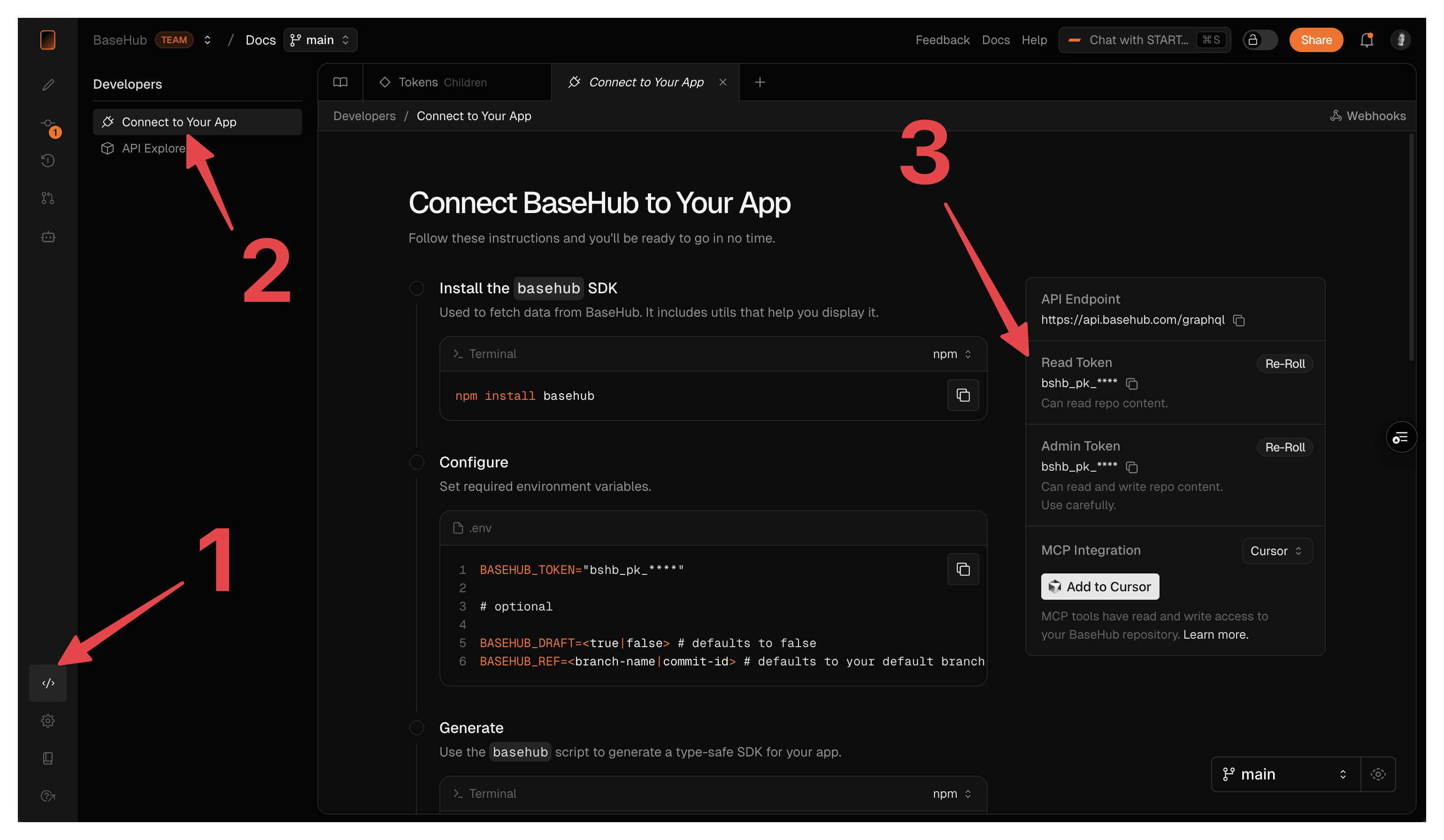
Help
CLI
Generates a type-safe client based on your Repo's schema.
Generate
basehub generateThis command will get your BaseHub Token from your environment using dotenv-mono, use that to query the BaseHub API, and generate a type-safe SDK out of its schema.
Arguments
Aliases
Relevant Environment Variables
Dev
basehub devThe dev command is very useful for local development. It basically runs basehub generate --watch --draft [...args] (notice how watch and draft mode are both being forced).
query
The main method to consume data from your BaseHub repositories.
import { basehub } from 'basehub'
basehub().query({ })When your token is setup, basehub.query() will query the data from the token’s repository.
Inside the query object, you can pass any parameter that the Fetch API allows. That includes the Next.js revalidate parameters.
You can check out its usage in the GraphiQL Explorer linked to your schema.
Our <Pump/> component uses basehub.query() behind the scenes to retrieve the data, that’s way its props are so similar. The great advantage <Pump/> has it’s that it will stream your updates in real time while on draft mode.
Examples
Let’s see some common query patterns. Remember, the specific query keys you use will depend on your repository's structure, not on static API definitions.
Get a document block
basehub().query({
homepage: {
title: true,
description: {
json: { content: true },
},
},
})Get a list of posts
basehub().query({
posts: {
items: {
_id: true,
_title: true,
_slug: true,
// more fields here...
},
},
})Get the first item in a list
basehub().query({
posts: {
__args: { first: 1 },
items: {
_id: true,
_title: true,
_slug: true,
// more fields here...
},
},
})Filter by _slug
basehub().query({
posts: {
__args: {
first: 1,
filter: { _sys_slug: "your-post-slug" },
},
items: {
_id: true,
_title: true,
_slug: true,
// more fields here...
},
},
})Order by created date
basehub().query({
posts: {
__args: {
orderBy: "_sys_createdAt__DESC",
},
items: {
_id: true,
_title: true,
_slug: true,
// more fields here...
},
},
})Create and use a fragment
import { basehub, fragmentOn } from "basehub"
const buttonFragment = fragmentOn("ButtonComponent", {
label: true,
href: true,
variant: true,
})
basehub().query({
homepage: {
title: true,
description: {
json: { content: true },
},
cta: buttonFragment,
},
})Query a union
basehub().query({
dynamicPages: {
items: {
pathname: true,
sections: {
__typename: true, // required
on_HeroSectionComponent: {
title: true,
subtitle: true,
// more fields
},
on_FeatureSectionComponent: {
title: true,
subtitle: true,
// more fields
},
},
},
},
})mutation
The SDK method to make updates to your repository via the API.
import { basehub } from 'basehub'
basehub().mutation({ })The basehub.mutation() lets you send GraphQL mutations to the BaseHub API using any JavaScript framework. This is useful for mutating data from your app into your BaseHub Repo.
You can check out its usage in the GraphiQL Explorer linked to your schema.
Methods
The mutation API works a bit different to the query API due to how GraphQL is designed. basehub().mutation() has other methods to add data into BaseHub, the most important one being transaction.
transaction
The main mutation method, covers most of the modifications that can be done to the schema with three different transaction types: create, update and delete.
Example
Check out our Mutation API Playground for full examples.
Create
When running the create transaction, you will need to pass two additional parameters: parentId and data.
The parentId is the ID from the block where the creation will be done, could be any block, but that will affect which data structures are valid. In the example above, using that specific parentId we cannot insert anything apart from instances, because collection children are always instances (or a component that works as template).
The data field is the new block schema and values, including all its children.
Bulk Insert (Multiple Creations)
When using the create transaction type, the data field can accept either a single object or an array of objects. This allows you to create multiple instances inside the same parent block in a single transaction call.
Automatic Commit
The autoCommit is an optional field that accepts any string as the commit message that will be injected into the repository history. If not provided, the mutation updates will stay as work in progress (you will see them listed in your Changes Tab).
Example
Check out our Mutation API Playground for full examples.
Create
When running the create transaction, you will need to pass two additional parameters: parentId and data.
The parentId is the ID from the block where the creation will be done, could be any block, but that will affect which data structures are valid. In the example above, using that specific parentId we cannot insert anything apart from instances, because collection children are always instances (or a component that works as template).
The data field is the new block schema and values, including all its children.
transactionAsync
Same as `transaction`, but runs async—as a background job.
This method has the same signature as transaction. It’s useful in the case of a long-running job you don’t want to sit around waiting. You can use transactionStatus to get the status of the transaction in another Mutation call.
Example
Check out our Mutation API Playground for full examples.
getUploadSignedURL
A helper to upload assets to our database.
This is useful for example, when we have a PNG on our machine that we want to use in a BaseHub Image block. In order to use it, you should:
Call the getUploadSignedURL mutation1
You will need to retrieve both the signedURL and the uploadURL.
Do a PUT request to the signedURL2
The signedURL is an authorized endpoint that allows you to send any allowed asset through it. You’ll use it to upload the files you want to use in your BaseHub blocks.
Consume the uploaded data from uploadURL3
The uploadURL is the path to the uploaded file. After sending the asset data to the signedURL, you will be able to see the file in this URL. You will use it in the block value when running a transaction mutation.
Example
On this example we’re uploading a new image file to BaseHub assets pool.
You can explore the full code for this example in Github.
export const uploadImageToBaseHub = async (imageInput: File) => {
const { getUploadSignedURL } = await basehub().mutation({
getUploadSignedURL: {
__args: {
fileName: imageInput.name,
},
signedURL: true,
uploadURL: true,
},
});
const uploadStatus = await fetch(getUploadSignedURL.signedURL, {
method: "PUT",
body: imageInput,
headers: {
"Content-Type": imageInput.type,
},
});
if (uploadStatus.ok) {
return getUploadSignedURL.uploadURL;
}
return null;
};transactionStatus
Gets the current transaction status based on its ID.
Example
You can explore the full code for this example in Github.
export async function getStatus(id: string) {
const response = await basehub().mutation({
transactionStatus: {
__args: {
id,
},
},
});
return response.transactionStatus;
}<Pump />
A React Server Component that queries BaseHub and can subcribe to real time changes seamlessly.
import { Pump } from 'basehub/react-pump'Pump is a React Server Component, meaning, it can only be used within frameworks that support RSC (Next.js only for now).
The power of Pump comes when you use Next.js Draft Mode alongside it. Pump lets developers write their queries and rendering logic in a simple and typesafe way, and get “content fast refresh” (live preview) out of the box, without affecting the website’s performance in any way.
If you’re interested in how this works under the hood, or the reason behind its syntax, you can read our blog post about it.
Props
These are the props supported by <Pump /> .
Example
This query will get _sys.id from the API. Most importantly, when Next.js Draft Mode is enabled, it’ll subscribe to content changes in real time.
import { Pump } from "basehub/react-pump"
import { draftMode } from "next/headers"

const Page = () => {
  return (
    <Pump
      queries={[{ _sys: { id: true } }]}
      draft={draftMode().isEnabled}
      next={{ revalidate: 30 }}
    >
      {async ([data]) => {
        "use server"

        return (
          <pre>
            <code>{JSON.stringify(data, null, 2)}</code>
          </pre>
        )
      }}
    </Pump>
  )
}

export default Page<RichText />
Our official rich text renderer. Supports passing custom handlers for native html elements and BaseHub components.
import { RichText } from 'basehub/react-rich-text'A React Component that understands Rich Text Blocks’ data model and helps you render them in your website. If used in frameworks that support server components, it can be used as a RSC and just render the final result in the client without sending all the bundle to the client.
Props
These are the props supported by <RichText />
When you provide the value for the content property, the RichText component will retrieve your schema types and give you type-safety and auto-complete for the components property.
Example
import { Code, Heading, Link } from '@radix-ui/themes'
import NextLink from 'next/link'

export const ArticleBody = (props: ArticleFragment) => {
  return (
    <RichText
      content={props.content?.json.content}
      blocks={props.content?.json.blocks}
      components={{
        // native elements not present in this object will use the default handlers
        h1: ({ children }) => (
          <Heading as="h1" size="3" weight="medium">
            {children}
          </Heading>
        ),
        h2: ({ children }) => (
          <Heading as="h2" size="2" weight="medium">
            {children}
          </Heading>
        ),
        h3: ({ children }) => (
          <Heading as="h3" size="2" weight="medium">
            {children}
          </Heading>
        ),
        a: ({ children, ...rest }) => (
          <Link asChild>
            <NextLink {...rest}>{children}</NextLink>
          </Link>
        ),
        // Custom component
        CodeSnippetComponent: ({ children, isInline }) => {
          if (!isInline) return null
          return <Code>{children}</Code>
        },
      }}
    />
  )
}
Styling
The <RichText /> component doesn’t come with styles. It's job is to render the html notes, but you'll need to add the styles yourself. This is intentional, as websites often vary a lot between typographies, colors, and sizes.
there are a couple ways to style a rich text:
Use regular CSS
Use the tailwindcss-typography plugin (recommended)
Override each of the nodes with your own components
Moreover, all of these methods can be combined as you please.
1. Just CSS
As an example:
.post-body > *:first-child {
  margin-top: 0;
}

.post-body > *:last-child {
  margin-bottom: 0;
}

.post-body p {
  margin-bottom: 1em;
}

.post-body h1 {
  font-size: 2em;
  margin: 1.5em 0 0.5em;
}

.post-body h2 {
  font-size: 1.8em;
  margin: 1.4em 0 0.4em;
}

.post-body h3 {
  font-size: 1.4em;
  margin: 1.3em 0 0.3em;
}

.post-body ul,
.post-body ol {
  margin: 0 0 1em 1.5em;
}

.post-body li {
  margin-bottom: 0.5em;
}

.post-body img {
  max-width: 100%;
  height: auto;
  margin: 1em 0;
}

.post-body blockquote {
  border-left: 4px solid #ddd;
  padding-left: 1em;
  margin: 1em 0;
  font-style: italic;
  color: #666;
}

.post-body pre {
  background-color: #f4f4f4;
  padding: 1em;
  overflow-x: auto;
  margin: 1em 0;
}

.post-body code {
  background-color: #f4f4f4;
  padding: 0.2em 0.4em;
  border-radius: 3px;
}2. With tailwind-typography (recommended)
Assuming you’re already using tailwind, using the typography plugin is fairly simple.
pnpm i @tailwindcss/typography --save-devThen in tailwind.config.js
/** @type {import('tailwindcss').Config} */
module.exports = {
  theme: {
    // ...
  },
  plugins: [
    require('@tailwindcss/typography'),
    // ...
  ],
}
And finally, you’ll use the prose class in the wrapping <div>
import { RichText } from "basehub/react-rich-text"

const PostBody = (props) => {
  return (
    <div className="prose">
      <RichText {...props} />
    </div>
  )
}
3. Overriding / Using your own design system
If you already have components to render quotes, headings, paragraphs, etc, you can easily use them like this:
import { RichText } from "basehub/react-rich-text"
import {
  Heading,
  Blockquote,
  Paragraph,
} from "@my-design-system"

const PostBody = (props) => {
  return (
    <div>
      <RichText
        {...props}
        components={{
          p: (props) => <Paragraph {...props} />,
          h1: (props) => <Heading {...props} level={1} />,
          h2: (props) => <Heading {...props} level={2} />,
          h3: (props) => <Heading {...props} level={3} />,
          blockquote: (props) => <Blockquote {...props} />,
          // rest...
        }}
      />
    </div>
  )
}
Example: https://github.com/basehub-ai/docs-template/blob/main/app/_components/article/index.tsx#L182
Custom Components
If you are using Custom Blocks in your Rich Text, you’ll need to add them to your query, and pass them via the blocks prop. Then, you’ll be able to set up the custom renderers for them (in a type-safe manner, by the way):
import { Pump } from "basehub/react-pump"
import { RichText } from "basehub/react-rich-text"
import Image from "next/image"
import { Callout, CodeSnippet } from './path-to/components'

const Page = async () => {
  return (
    <Pump
      draft={draftMode().isEnabled}
      next={{ revalidate: 60 }}
      queries={[
        {
          homepage: {
            subtitle: {
              json: {
                content: true,
                blocks: {
                  __typename: true,
                  on_CalloutComponent: {
                    _id: true,
                    intent: true,
                    text: true,
                  },
                  on_CodeSnippetComponent: {
                    _id: true,
                    code: {
                      code: true,
                      language: true,
                    },
                    fileName: true,
                  },
                }
              }
            },
          },
        },
      ]}
    >
      {async ([{ homepage }]) => {
        "use server"
        return (
          <RichText
            blocks={homepage.subtitle.json.blocks}
            components={{
              img: (props) => <Image {...props} />,
              CalloutComponent: (props) => <Callout data={props}>,
              CodeSnippetComponent: (props) => <CodeSnippet data={props}>,
            }}
          >
            {homepage.subtitle.json.content}
          </RichText>
        )
      }}
    </Pump>
  )
}

export default Page
Internal Links
Similar to external hyperlinks, internal links in your rich text let you reference other blocks in an easy and type-safe manner.
import { Pump } from "basehub/react-pump"
import { RichText } from "basehub/react-rich-text"
import Image from "next/image"

const Page = async () => {
  return (
    <Pump
      queries={[
        {
          homepage: {
            subtitle: {
              json: {
                content: true,
                blocks: {
                  __typename: true,
                  on_PostComponent: {
                    _slug: true,
                  },
                },
              },
            },
          },
        },
      ]}
    >
      {async ([{ homepage }]) => {
        "use server"
        return (
          <RichText
            blocks={homepage.subtitle.json.blocks}
            components={{
              img: (props) => <Image {...props} />,
              a: ({ internal, ...props }) => {
                if (internal) {
                  switch (internal.__typename) {
                    case "PostComponent":
                      return (
                        <a {...props} href={`/blog/${internal._slug}`} />
                      )
                    default:
                      return null
                  }
                } else return <a {...props} />
              },
            }}
          >
            {homepage.subtitle.json.content}
          </RichText>
        )
      }}
    </Pump>
  )
}

export default Page
<CodeBlock />
Easy-to-use component for rendering great code snippets.
import { CodeBlock } from 'basehub/react-code-block'There are many syntax highlighting libraries in the JavaScript ecosystem. While this is a good thing, it can be exhausting for developers to shop for the right one. Prism, highlight.js, and Shiki are the most popular ones—an, in our opinion, Shiki is the best.
After building multiple websites with syntax highlighting, we’ve found ourselves copy-pasting a bunch of code and needing to re-read documentation over and over again. This is why we’ve built this.
Props
These are the props supported by <CodeBlock />
Basic Usage
import { CodeBlock } from 'basehub/react-code-block'

const Post = () => {
  return (
    <CodeBlock
      theme="github-dark"
      snippets={[{ code: `const hello = "world"`, lang: 'js' }]}
    />
  )
}
CSS Theme
import { CodeBlock } from 'basehub/react-code-block'

const Post = () => {
  return (
    <CodeBlock
      theme="github-dark"
      snippets={[{ code: `const hello = "world"`, lang: 'js' }]}
    />
  )
}
Examples
useSearch
A React hook that instantiates your Search Client.
import { useSearch } from 'basehub/react-search'Arguments
BaseHub Search uses TypeSense on the background. You can check out all the search options on their documentation. Keep in mind that they’re all on camelCase in the useSearch hook. E.g: filter_by is listed as filterBy.
Examples
Documentation: Step by step
Also you can check out our search implementation for this Documentation template on GitHub
<SearchBox.Root />
The Search wrapper works as a provider and comes with some optional props that can come in handy.
import { SearchBox } from 'basehub/react-search'

// -> SearchBox.Root
Props
Examples
Documentation: Step by step
Also you can check out our search implementation for this Documentation template on Github
<SearchBox.Input />
Extends the native HTML Input and consumes the search context in order to fetch hits from the indexed data.
import { SearchBox } from 'basehub/react-search'

// -> SearchBox.Input
Props
The <SearchBox.Input /> extends the native HTMLInputProps.
Examples
Documentation: Step by step
Also you can check out our search implementation for this Documentation template on Github
Hit Components
Use cases and APIReference for HitList, HitItem, HitSnippet
<SearchBox.HitList /> Props
import { SearchBox } from 'basehub/react-search'

// -> SearchBox.HitList<SearchBox.HitItem /> Props
import { SearchBox } from 'basehub/react-search'

// -> SearchBox.HitItem
The <SearchBox.HitItem /> extends the native HTMLDivProps.
Both HitList and HitItem provide keyboard navigation out-of-the-box.
<SearchBox.HitSnippet /> Props
import { SearchBox } from 'basehub/react-search'

// -> SearchBox.HitSnippet
The HitSnippet works as sugar syntax to render specific fields of the hit object with ease.
<Icon />
A vector renderer for our icon block. Supports passing custom handlers for native svg elements.
import { Icon } from 'basehub/react-icon'A React Component that understands Rich Text Blocks’ data model and helps you render them in your website. If used in frameworks that support server components, it can be used as a RSC and just render the final result in the client without sending all the bundle to the client.
Props
These are the props supported by <Icon />
Example
import { Code, Heading, Link } from '@radix-ui/themes'
import NextLink from 'next/link'

export const ArticleBody = (props: ArticleFragment) => {
  return (
    <RichText
      content={props.content?.json.content}
      blocks={props.content?.json.blocks}
      components={{
        // native elements not present in this object will use the default handlers
        h1: ({ children }) => (
          <Heading as="h1" size="3" weight="medium">
            {children}
          </Heading>
        ),
        h2: ({ children }) => (
          <Heading as="h2" size="2" weight="medium">
            {children}
          </Heading>
        ),
        h3: ({ children }) => (
          <Heading as="h3" size="2" weight="medium">
            {children}
          </Heading>
        ),
        a: ({ children, ...rest }) => (
          <Link asChild>
            <NextLink {...rest}>{children}</NextLink>
          </Link>
        ),
        // Custom component
        CodeSnippetComponent: ({ children, isInline }) => {
          if (!isInline) return null
          return <Code>{children}</Code>
        },
      }}
    />
  )
}
Styling
The <Icon /> component doesn’t come with styles. It's job is to render the block content as an svg element, but you'll need to add the styles yourself. You can either do so in your codebase, or in the svg you define in the Icon block at BaseHub.
there are a couple ways to style an icon:
Use regular CSS
Override each of the nodes with your own components
Moreover, all of these methods can be combined as you please.
1. Just CSS
As an example:
.social-links {
  display: flex;
  gap: 6px;
  color: '#ededed';
  width: 24px;
  height: 24px;
}2. Overriding
In case you’re using tailwind, you can easily style them like this:
import { Icon } from "basehub/react-icon"

const PostBody = (props) => {
  return (
    <div>
      <Icon
        {...props}
        components={{
          svg: (props) => <svg {...props} className="size-6 text-gray/10" />,
          // rest...
        }}
      />
    </div>
  )
}
sendEvent
The events method to send data through BaseHub. Flexible, type-safe and scoped by block.
import { sendEvent } from 'basehub/events'Parameters
Example
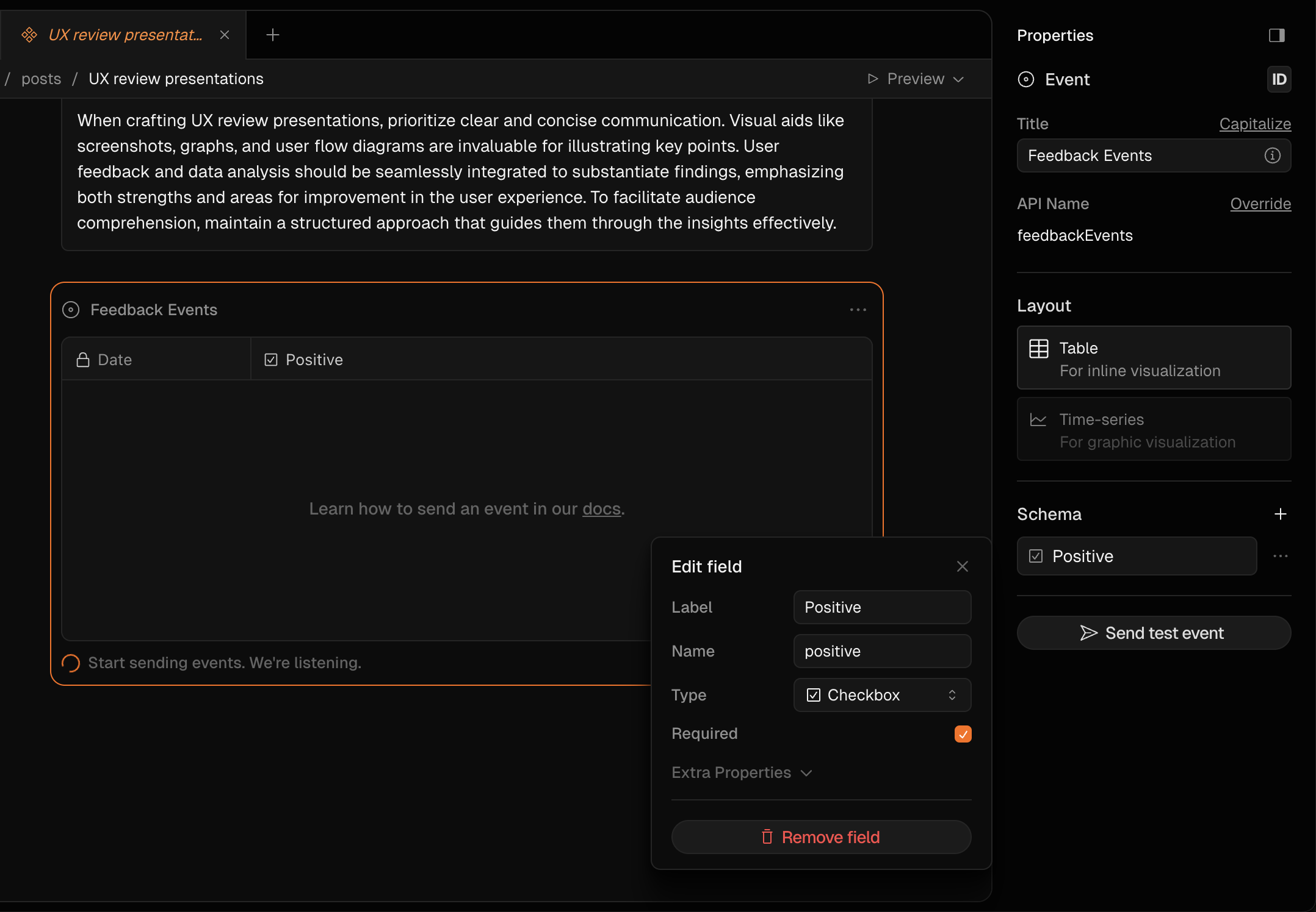
'use client'
// you'll need to run basehub before importing this type 👇🏼
import type { FeedbackEvents['ingestKey'] } from '~/.basehub/schema'
import { sendEvent } from 'basehub/events'
import { Card, IconButton } from '@radix-ui/themes'
import { ThumbsDown, ThumbsUp } from 'lucide-react'
import * as React from 'react'

export const Feedback = ({
  ingestKey,
}: {
  ingestKey: FeedbackEvents['ingestKey']
}) => {
  const [sentFeedback, setSentFeedback] = React.useState<
    'positive' | 'negative' | null
  >(null)

  const handleFeedback = (type: 'positive' | 'negative') => {
    if (sentFeedback === type) return
    sendEvent(ingestKey, { positive: type === 'positive' })

    setSentFeedback(type)
  }

  return (
    <Card variant="classic" size="3">
      <IconButton onClick={() => handleFeedback('negative')}>
        <ThumbsDown fill={sentFeedback === 'negative' ? 'var(--accent-12)' : 'none'} />
      </IconButton>
      <IconButton onClick={() => handleFeedback('positive')}>
        <ThumbsUp fill={sentFeedback === 'positive' ? 'var(--accent-12)' : 'none'} />
      </IconButton>
    </Card>
  )
}
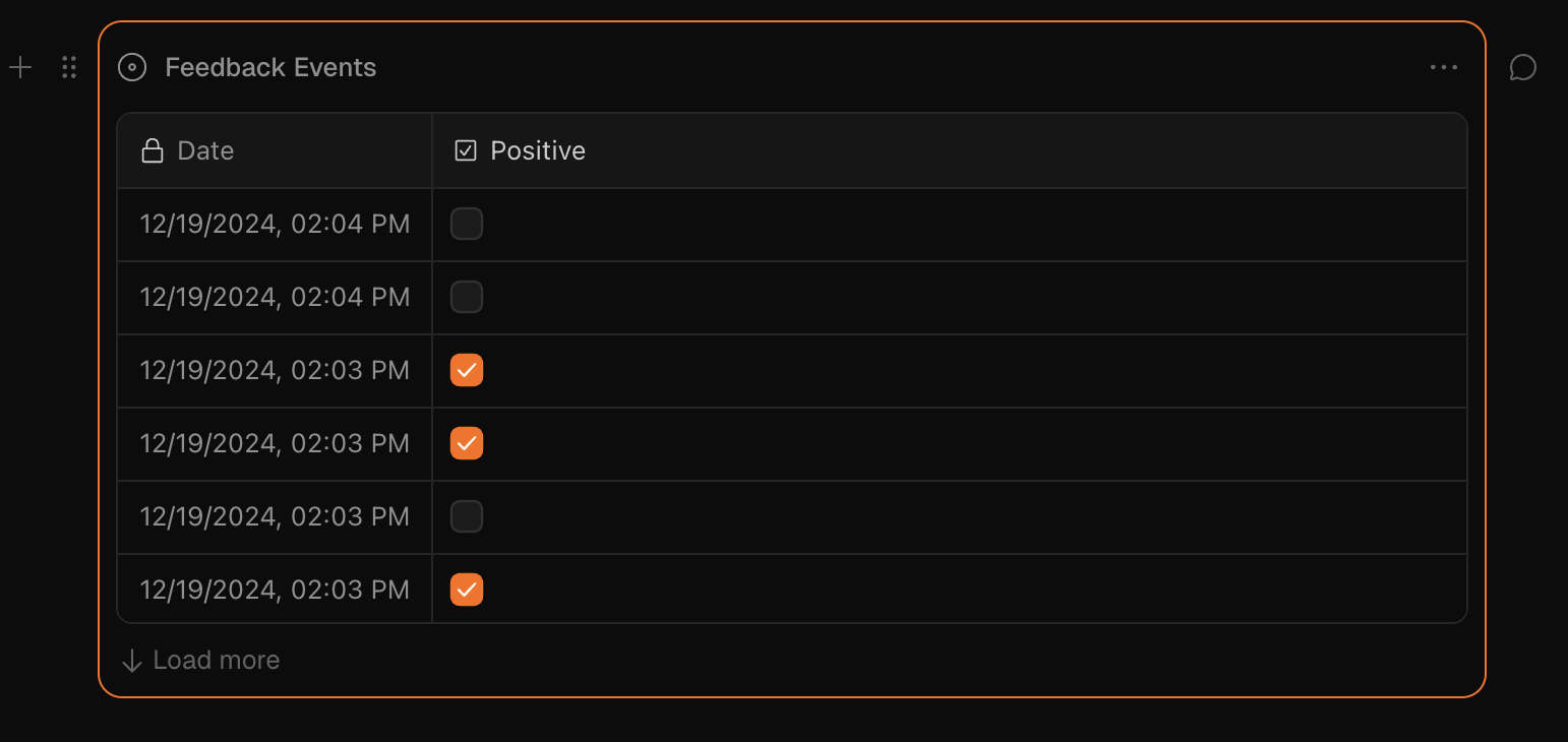
getEvents
A query method to retrieve your events stored in BaseHub.
import { getEvents } from 'basehub/events'Parameters
Table Query
Time-series Query
Be wary of exposing the adminKey in the client. Anyone with this key will be able to read and update existing events from that specific block.
Examples
import { getEvents } from "basehub/events"

// Table query
const tableData = await getEvents("analytics:pageviews", {
  type: "table",
  first: 10,
  skip: 0,
})

// Time-series query
const timeSeriesData = await getEvents("analytics:pageviews", {
  type: "time-series",
  range: "month",
})
import { getEvents } from "basehub/events"
import { IncrementViews } from "./increment-views"
import { unstable_noStore } from "next/cache"
import { draftMode } from "next/headers"
import type { PageViews } from "~/.basehub/schema"
export const ViewsFragment = async ({
adminKey,
ingestKey,
increment,
}: {
adminKey: PageViews["adminKey"]
ingestKey: PageViews["ingestKey"]
increment?: boolean
}) => {
unstable_noStore()
const { isEnabled: isDraftMode } = draftMode()
const { data: views } = await getEvents(adminKey, {
type: "time-series",
range: "all-time",
})
return (
<>
{views || "0"}
{increment && !isDraftMode && (
<IncrementViews ingestKey={ingestKey} />
)}
</>
)
}updateEvent
Method that allows modifying existing events by their ID.
import { updateEvent } from "basehub/events"Parameters
Returns
{ success: true; eventId: string } | { success: false; error: string }deleteEvent
Method that removes one or more events by their IDs.
import { deleteEvent } from "basehub/events"Parameters
Returns
{ success: true } | { success: false; error: string }search
Core method to perform a search query.
import { search } from 'basehub/search'Using React? Check out our React helpers right here.
Arguments
getClientRaw
Get the raw search client.
import { getSearchClientRaw } from 'basehub/search'Using React? Check out our React helpers right here.
Arguments
<Toolbar />
The official BaseHub toolbar to manage draft mode and switch branches in your site previews.
import { Toolbar } from 'basehub/next-toolbar'The Toolbar takes care of setting and managing the draftMode key without any other configuration or manual fetch to the BaseHub API.
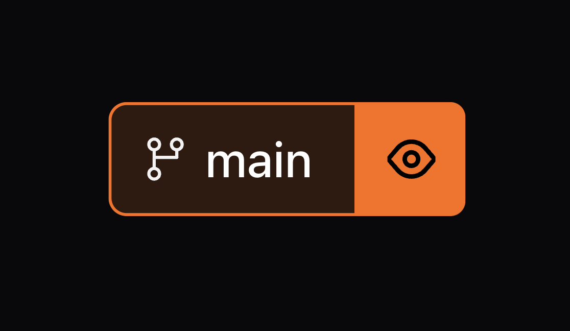
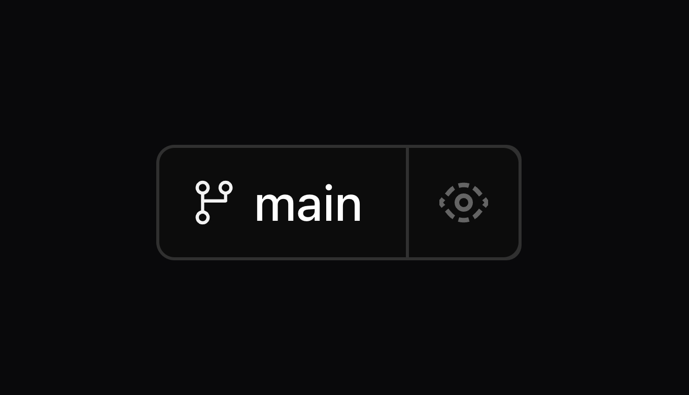
Props
Example
import { Toolbar } from 'basehub/next-toolbar'

export default async function RootLayout({
  children,
}: Readonly<{
  children: React.ReactNode
}>) {
  return (
    <html lang="en">
      <Toolbar />
      <body>
        <ThemeProvider>
          <Header />
          {children}
          <Footer />
        </ThemeProvider>
      </body>
    </html>
  )
}
Version 9
Learn how to upgrade from v8 to v9.
pnpm i basehub@latestv9 doesn’t introduce too many new features nor breaking changes, but it does fundamentally change how types are generated. Critically, the basehub SDK can now work without a “generation step”, and the generation step now only augments the SDK with type information.
This seems subtle, but fixes many bugs related to basehub not being able to resolve. For context, before v9, running basehub dev or basehub build was required for the runtime to get its graphql client. The generation step created the SDK, plus the types. Now, the client is “static” in the sense that’s ready to use once installed, and the generation step is just there for optional typesafety. Additionally, this typesafety works with TypeScript’s declaration merging, which means no more “Restart TS server” to make types work again.
New Features and Bug Fixes
basehubnow works without a “generation step”, albeit without types.Running
basehub devorbasehub buildis now not required by the runtime. That being said, it’s recommended you keep them as they’re in charge of generating types.
“Restart TS Server” in your IDE should be much less needed.
SDK Breaking Changes
The SDK now exposes an ESM-only bundle and uses
package.json’s"exports"field for subpath exports. As a result, yourtsconfig.jsonmust set"moduleResolution"to"nodenext"or"bundler"undercompilerOptionsfor TypeScript to resolve modules correctly.strictNullChecks: trueis required in order for types to work correctly.Deprecation of the
.basehubdirectory. Now, the generation creates abasehub-types.d.tsfile and abasehub.config.ts. Both files are optional (the runtime doesn’t depend on them at all).This means that old type imports, like
import { QueryGenqlSelection } from ‘@/.basehub’or similar, should now be directed tobasehub-types.d.ts
createClientis no longer exported from”basehub”. This function was an alias toimport { basehub } from 'basehub'and we don’t see a point in having that, so we removed it.
API Breaking Changes
None
That should be all!
Version 8
Learn how to upgrade from v7 to v8.
pnpm i basehub@latestNew Features
basehub/events: a new package used to interact with the Event Block.basehuband<Pump />now automatically inferdraftModefrom Next.js.<Toolbar />now includes a Branch Switcher!Support for internal links in <RichText />
SDK Breaking Changes
basehub/analyticshas been deprecated in favour ofbasehub/events. They are slightly different things, but Events should be able to cover analytics use cases, and more.<CodeBlock />:
langwas renamed tolanguageto better match the props of theprehandler in <RichText /><RichText />: The
codehandler before received a prop namedisInline, but now, it won’t receive that and it will just be used for inline code. Theprehandler will be used for full code blocks.
API Breaking Changes
Now, if a Reference Block has just one “allowed type”, we won't type it as a GraphQL Union, but rather, just return the end-type directly. this might break queries that did the
... on SomeTypething.
# before
{
 someReference {
    ... on AuthorComponent {
      name
    }
  }
}
# after
{
someReference {
name
}
}In our Mutation API, we renamed the following:
transactionis nowtransactionAsynctransactionAwaitableis nowtransaction
A bit confusing, yes, but we found that transactionAwaitable (which executed the transaction and responded with the result) was much more useful than the old transaction, which fired off a job and then it was up to the developer to poll for the transactionStatus. The name "transactionAwaitable" was a poorly thought out name, and we've taken the opportunity of a breaking version to fix this.
Analytics → Events
We’ve renamed the /analytics entrypoint to /events
import { sendEvent, getEventCount } from 'basehub/analytics'
import { sendEvent, getEvents } from 'basehub/events'
That should be all!
Explorer
Explore the GraphQL API interactively, thanks to the power of GraphiQL.
By default, this Explorer is connected to our documentation’s repo; but you can enter your repo’s token to explore it’s schema. All credits for this explorer go to the GraphiQL project.
Due to how dynamic the schema is, we believe the best way to know how it’s structure is to use the explorer and check it out. Open the explorer’s documentation, try out some queries, and you can always let us know if you need any help.
Mutation API Guidelines
Learn how to create, update, and delete content in BaseHub using the Mutation API with detailed examples and best practices.
The Mutation API allows you to programmatically create, update, and delete content in your BaseHub repository. This guide covers all operation types with detailed examples and best practices.
Operation Types
You can perform three types of operations:
create: Add new blocksupdate: Modify existing blocksdelete: Remove blocks
Create Operations
Create a Text Block
{
  "parentId": "<layout-block-id>",
  "data": [{
    "type": "text",
    "title": "Hero Title",
    "value": "A purpose-built tool for planning and building products",
    "isRequired": true
  }]
}
In general, you'll want to mark all blocks as required.
Create a Component Block
{
  "parentId": "<layout-block-id>",
  "data": [{
    "transactionId": "cta-component",
    "type": "component",
    "title": "CTA",
    "hidden": true,
    "value": [
      {
        "type": "text",
        "title": "Label",
        "value": "",
        "isRequired": true
      },
      {
        "type": "text",
        "title": "Href",
        "value": "",
        "isRequired": true
      },
      {
        "type": "select",
        "title": "Variant",
        "value": ["primary"],
        "acceptedValues": ["primary", "secondary", "ghost"],
        "multiple": false,
        "isRequired": true,
        "description": "We'll style the button based on the variant"
      }
    ]
  }]
}
Notice how we're not using children for nesting, but rather, we just use the value field, which in the case of layout blocks, accept an array of blocks.
Create an Instance Block
{
  "parentId": "<layout-block-id>",
  "data": [{
    "type": "instance",
    "title": "Sign Up Button",
    "mainComponentId": "cta-component",
    "value": {
      "label": {
        "type": "text",
        "value": "Sign Up for Free"
      },
      "href": {
        "type": "text",
        "value": "/sign-up"
      },
      "variant": {
        "type": "select",
        "value": ["primary"]
      }
    }
  }]
}
Key points about instances:
We use
mainComponentIdto reference the componentThe instance's
valuefield is an object defining values via their API Names
Create a Collection Block
{
  "parentId": "<layout-block-id>",
  "data": [{
    "type": "collection",
    "title": "Authors",
    "template": [
      {
        "type": "text",
        "title": "Role",
        "isRequired": true
      },
      {
        "type": "media",
        "title": "Avatar",
        "isRequired": true
      }
    ],
    "rows": [
      {
        "type": "instance",
        "title": "Frank Ocean",
        "value": {
          "role": {
            "type": "text",
            "value": "Musician"
          },
          "avatar": {
            "type": "media",
            "value": {
              "url": "https://assets.basehub.com/example.jpg",
              "fileName": "frank-ocean-avatar.jpg",
              "altText": "Frank Ocean"
            }
          }
        }
      }
    ]
  }]
}
Create a Workflow Block
Workflow blocks enable automation in your BaseHub repository. They define triggers and actions that execute automatically when certain conditions are met.
{
  "parentId": "<layout-block-id>",
  "data": [{
    "type": "workflow",
    "title": "Author Bio Update Workflow",
    "value": {
      "trigger": {
        "type": "layout-block",
        "blocks": [
            "<trigger-block-id>", "<trigger-block-id>"
        ],
        "events": [ "updated" ]
      },
      "actions": [
        {
          "type": "webhook",
          "url": "https://<your-url>.com/api/notify"
        },
        {
          "type": "notification",
          "userIds": ["<user-id>"]
        },
        {
          "type": "ai-autofill",
          "block": "<block-to-autofill>",
          "prompt": "Complete the bio based on the title",
          "changeType": "direct"
        }
      ]
    }
  }]
}
Key components of a workflow:
trigger: Defines when the workflow should executeactions: Array of actions to execute when triggered
Workflow Triggers
Layout Block Trigger: Triggers when specific blocks are modified
"trigger": {
  "type": "layout-block",
  "blocks": ["block-id-1", "block-id-2"],
  "events": ["created", "updated", "deleted"]
}
blocks: Array of block IDs to watch. The must be siblings: Have the same parent layout block.events: Array of events (created,updated,deleted)
Workflow Actions
Webhook Action: Sends an HTTP POST request to a specified URL
{
  "type": "webhook",
  "url": "https://your-api.com/webhook"
}
Notification Action: Sends in-app notifications to specified users
{
  "type": "notification",
  "userIds": ["user-id-1", "user-id-2"]
}
AI Autofill Action: Uses AI to automatically fill block content
{
  "type": "ai-autofill",
  "block": "target-block-id",
  "prompt": "Generate content based on context",
  "changeType": "direct" | "suggestion" | "auto-commit"
}
direct: Automatically applies the AI-generated contentsuggestion: Creates a suggestion for manual approvalauto-commit: Applies the content and auto-commits that specific change
AI Autofill Variant Action: Uses AI to fill variant-specific content
{
  "type": "ai-autofill-variant",
  "changeType": "direct" | "suggestion" | "auto-commit",
  "block": "variant-set-block-id",
  "prompt": "Generate localized content"
}
Update Operations
Update a Text Block
{
  "data": [{
    "id": "<block-id>",
    "title": "Updated Title",
    "value": {
      "role": {
        "type": "text",
        "value": "Producer and Podcast Host"
      }
    }
  }]
}
Update a Workflow Block
When updating a workflow, you can modify the trigger conditions, add/remove actions, or change action parameters:
{
  "data": [{
    "id": "workflow-id",
    "type": "workflow",
    "value": {
      "trigger": {
        "type": "layout-block",
        "blocks": [
          "trigger-block-id"
        ],
        "events": [
          "updated"
        ]
      },
      "actions": [
        {
          "type": "webhook",
          "url": "https://your-api.com"
        },
        {
          "type": "notification",
          "userIds": []
        },
        {
          "type": "ai-autofill-variant",
          "changeType": "suggestion",
          "block": "variant-set-block-id",
          "prompt": ""
        },
        {
          "type": "ai-autofill",
          "block": "block-to-auto-fill",
          "prompt": "Complete the bio based on the title",
          "changeType": "direct"
        }
      ]
    }
  }]
}
Update with Variants
{
  "data": [{
    "id": "<block-id>",
    "value": {
      "heroTitle": {
        "type": "text",
        "variantOverrides": {
          "language-es": {
            "value": "Finalmente, un CMS que se mueve tan rápido como tú."
          }
        }
      }
    }
  }]
}
Primitive Block Value Formats
Here are all primitive block types and their corresponding value formats:
text:
{ "type": "text", "value": "string content" }number:
{ "type": "number", "value": 123 }boolean:
{ "type": "boolean", "value": true }date:
{ "type": "date", "value": "2025-03-07" }color:
{ "type": "color", "value": "#RRGGBB" }media:
{ "type": "media", "value": { "url": "...", "fileName": "...", "altText": "..." } }reference (single):
{ "type": "reference", "value": "block-id" }reference (multiple):
{ "type": "reference", "multiple": true, "value": ["block-id-1", "block-id-2"] }event:
{ "type": "event", "value": { "schema": {}, "view": 'table' | 'chart' } }workflow:
{ "type": "workflow", "value": { "trigger": {}, "actions": [] } }
Rich Text Format
{
  "type": "rich-text",
  "value": {
    "format": "json",
    "value": [...] // ProseMirror-compatible JSON
  }
}
Code Snippet Format
{
  "type": "code-snippet",
  "value": {
    "code": "const hello = 'world';",
    "language": "javascript"
  }
}
Workflow Block Best Practices
Be specific with triggers: Only watch the blocks that are relevant to your automation
Use meaningful titles: Name your workflows descriptively for easier management
Test AI prompts: Use
suggestionchangeType first to verify AI outputs before switching todirectOrder actions logically: Actions execute in sequence, so plan the order carefully
Validate webhook endpoints: Ensure your webhook URLs are accessible and handle BaseHub's payload format
Common Mutation API Errors
Rich Text Formatting Mismatch
Passing format: "json" with a markdown string will result in an error. You should pass a Rich Text JSON object instead.
Workflow Validation Errors
Invalid block IDs: Ensure all referenced block IDs exist in your repository
Missing required fields: Each action type has required fields that must be provided
Query API Guidelines
Master GraphQL querying in BaseHub with comprehensive examples for layout and primitive blocks, filtering, ordering, and variants.
The Query API is GraphQL-based, allowing you to fetch content from your BaseHub repository using GraphQL queries.
Layout Blocks
These blocks typically contain other nested blocks. They're key to giving the repository a tree-like structure. They're all objects and share some common GraphQL keys:
_title: string
_slug: string, auto generated based on the title
_sys: object containing system fields like apiNamePath, createdAt, hash, id, idPath, lastModifiedAt, slug, slugPath, title
Document
A single document/page, for example "homepage", or "about page", or something more generic like "globals" or "settings".
Component
Like a document, but used to reutilize structures/schemas, like a "CTA", or even a section like "Features Grid Section", or a "Callout" to be used within a Rich Text block. It's quite flexible.
Instance
Which practically targets a Component and sticks to its structure.
List
Meant to be used for listing things. Gets its columns by targeting a Component and using it as "template". Has rows (instances), which are the actual items in the list. Useful for things like "Blog Posts", "Authors", "Categories", "Testimonials", etc.
List blocks have a GraphQL object with the following keys:
items: array of rows returned after applying sorts, filters, and pagination
item: grabs the first item from the items array
_meta: contains totalCount and filteredCount
List blocks receive optional arguments:
orderBy: enum for sorting (e.g.,
createdAt__DESC)filter: object for filtering based on field types
first: number, takes the first N items
skip: number, skips N items
Query Examples
Get the first 10 posts
{
  posts(first: 10) {
    items {
      _id
      _title
      date
      excerpt
      body {
        json {
          content
        }
      }
    }
  }
}
Get a specific post by slug
{
  posts(filter: { _sys_slug: { eq: "my-blog-post-slug" } }) {
    items {
      _id
      _title
      date
      excerpt
      body {
        json {
          content
        }
      }
    }
  }
}
Reference Blocks
Can target an Instance or a Component. Reference blocks take the structure of the component(s) they target:
If
acceptedTypeshas just one component id, it takes that component's structureIf
acceptedTypeshas multiple component ids, it becomes a union
Single Reference Type
{
  demo {
    author {
      _title
      xUsername
      bio {
        json {
          content
        }
      }
    }
  }
}
Multiple Reference Types (Union)
{
  demo {
    author {
      ... on Author {
        _title
        xUsername
        bio {
          json {
            content
          }
        }
      }
      ... on ExternalPerson {
        _title
        linkedinUrl
        company
        role
      }
    }
  }
}
Primitive Blocks
These blocks typically contain the largest parts of the content. An important prop is the isRequired prop, which makes the field nullable or non-nullable accordingly.
Text, Number, Boolean
Self explanatory primitive types.
Date
ISO date string.
Select
If multiple={true}, it returns an array of strings. Else, it returns a single string.
Media
An object with the following properties:
url: string (can receive args: width, height, format, quality, blur)
alt: string (nullable)
width, height: number (nullable)
blurDataURL: string (nullable)
mimeType, fileName: string
Rich Text
Rich text blocks have a GraphQL object with the following keys:
json: contains
content(JSON definition) and optionalblocksarraymarkdown: string representation
html: HTML representation
plainText: plain text representation
readingTime: number in minutes
Rich Text Examples
{
  about {
    subtitle {
      json {
        content
      }
    }
  }
}
Code Snippet
An object with code and language string properties.
Color
An object with hex, rgb, and hsl string properties.
Variant Sets
The variant set block is used to have different values for the same block. Different variants are defined inside a variant set block.
Get variant set information
{
  settings {
    languages {
      variants {
        id
        isDefault
        label
        apiName
      }
    }
  }
}
Query specific variant
{
  chapters {
    items {
      lessons(variants: { languages: es }) {
        items {
          transcription {
            plainText
          }
          video {
            url
          }
        }
      }
    }
  }
}
Common Errors
Missing items wrapper
❌ Incorrect:
{
  posts(filter: { _sys_slug: { eq: "my-blog-post-slug" } }) {
    _id
    _title
    date
  }
}
✅ Correct:
{
  posts(filter: { _sys_slug: { eq: "my-blog-post-slug" } }) {
    items {
      _id
      _title
      date
    }
  }
}
Missing content in rich text
❌ Incorrect:
{
  about {
    subtitle {
      json
    }
  }
}
✅ Correct:
{
  about {
    subtitle {
      json {
        content
      }
    }
  }
}
Incorrect variant placement
❌ Incorrect (variants on primitive blocks):
{
  chapters {
    items {
      lessons {
        items {
          transcription(variants: { languages: es }) {
            plainText
          }
        }
      }
    }
  }
}
✅ Correct (variants on layout blocks):
{
  chapters {
    items {
      lessons(variants: { languages: es }) {
        items {
          transcription {
            plainText
          }
        }
      }
    }
  }
}
Anatomy of a Block
You can think of your Repository as a tree of Blocks. Let's explore how this works.
Similar to Notion’s data model, every piece of content in BaseHub is a Block. You can think of your Repository as a tree of Blocks. It all starts with the Root Block—although you won’t see it—, which has nested Blocks within.
We conceptually split Blocks into two categories: Layout, and Primitive Blocks. In the next sections, you’ll read more about them.
Blocks contain schema and content. In contrast to other CMSs, where developers define a schema and then add the content, in BaseHub, this can happen at the same time due to how flexible our data model is.
As you add new Blocks and nest and reorder them, you’ll be altering your Repo’s Schema. That is, the structure that will be then distributed via GraphQL and into your website. Schemas become composable with a special Block called “Component”. Read more about it here.
UI
This is how Blocks get rendered.
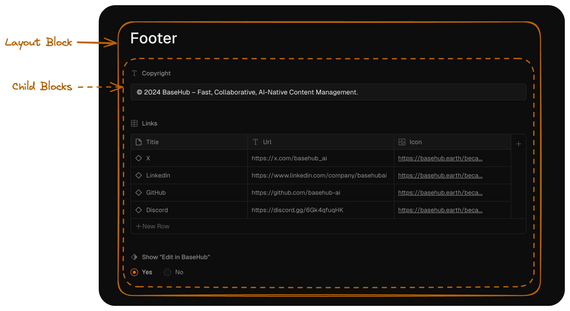
Zoom into a specific Block
In this case, a Text Block.
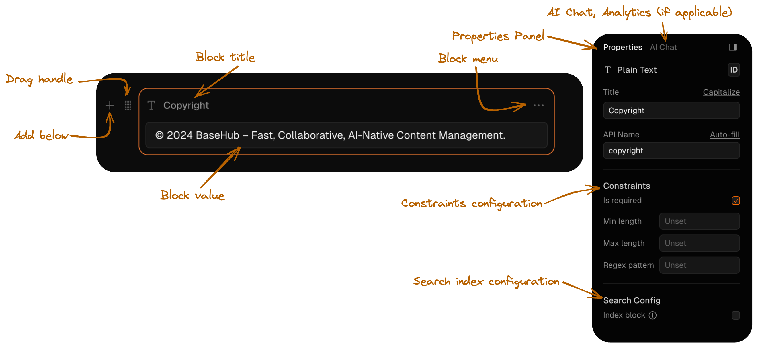
Slash command
To add new blocks.
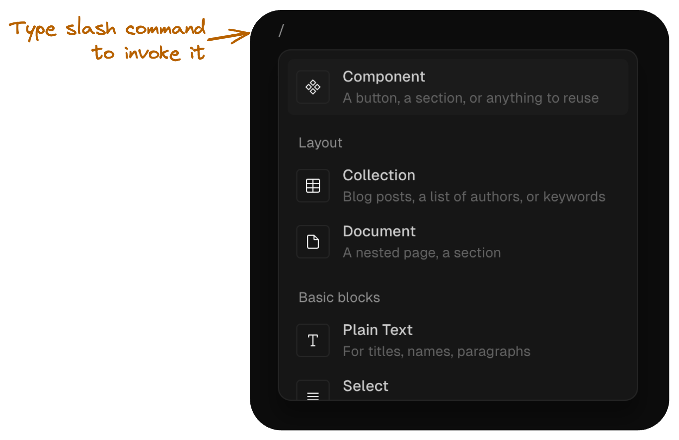
Sidebar
Makes it easy to get around your Repo.
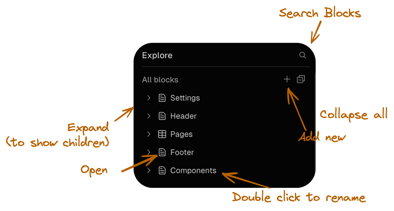
Tabs
Shows active Blocks.

Root
The root of the Tree.
The Root Block is invisible from the editor explorer, but wraps within every other Block in the repository.
Each Commit in BaseHub targets a single root block. This root block wil target nested blocks, and nested blocks can have more nested blocks, thus creating a tree.
Document
The most common layout block in BaseHub. Think of them as directories in a file system.
Features
✅ Ideal for singleton types, such as a “homepage”
✅ It can have nested blocks
✅ It can be converted into a Component
✅ It can be hidden
Common Patterns
Although you’re free to structure your Repository however you like, there are some common patterns that can be useful for getting started.
Have a “Components” document in which you’ll store common, reusable components, such as “Button”, “Feature Card“, “Tweet“, or similar.
Have a “Collections” document in which you’ll have different collections, such as “People”, “Testimonials”, “Snippets”, or similar.
Have a “Settings” document in which you’ll store general data, such as site-wide metadata, or constants such as social media links.
Component
The Component block functions as a modular structure within your repository, that can be reused across your schema.
Features
✅ Ideal for reusable types, such as a “CTA” or “Article”
✅ It can have nested blocks
✅ It can be converted into a Document
✅ It can be hidden
Each Component outlines a schema, and the content for each instance is then defined within those parameters. The main difference here with other CMSs is that the Component is a source of content at the same time that defines the schema.
Component creation
To create a Component, you can start from scratch or transform an existing Document into a Component. To do this, simply click the "Make Component" button found in the Document properties panel. This action changes the block type, enabling its reuse as an instance throughout your project.
Detaching
If you need to transform a Component back into a Document, or if you wish to convert an instance into a standalone Component, you will need to detach the main Component first. By selecting the “Detach Component” button, you’ll convert that block back into a Document. An Instance will be then converted into a Component with that same structure, thus preserving all of the existing instances as they are. No data will be lost during this transition; however, existing instances will now target this new “promoted” instance.
Nesting components
Unlike other structures, Components cannot embed Documents within them. If your design calls for a more layered structure with nested layout blocks, you can achieve this by nesting multiple components or instances. To nest components, simply access the slash command within your main component; it will display the option to insert another component right inside it.
Display Info
You can define some helpful display information for each Component, so that content editors can understand more about how to use it.
You’ll be able to edit Display Info in the Properties Panel (right hand side) of a Component.
Instance
A modular block that reuses the structure from your Components.
Features
✅ Ideal for reusable types, such as a “CTA” or “Article”
✅ It can have nested blocks—although it follows the structure of its target component
✅ It can be hidden
Instances are created from components stored in your repository and can be used in all sorts of ways, fitting into many different scenarios. For example, a component and its instances can be listed in a Document block to structure sections of a landing page. Alternatively, you could create a component in a union block with multiple fields, and create various instances from it.
What you can do in Instances
Instances have their own values, so you can update its title and fill every child input. That includes rows in a collection, references and any other input.
What you cannot do in Instances
You cannot modify the schema in any way, you cannot modify constraints or collection columns, allowed types, children titles, etc.
Special cases
OG Image
The OG Image block can only be modified in the main component. That’s the case because every change in the OG Image block is a properties change. But that doesn’t mean that every instance will have the exact same OG image, since you can use variables for text and images, so they will automatically update those based on the current instance they’re set in. Learn more about the OG Image.
Collection
A powerful list of blocks that can be fully customizable.
Features
✅ Ideal for repeatable content, such as a list of “Posts“, “Authors“
✅ It can be searched through (using BaseHub Search)
✅ Updates can be tracked by Workflow blocks.
Constraints
As its name implies, you can make a Collection out of anything in BaseHub. Each new collection starts with an empty "Template" Component, which can be customized or replaced with an existing Component from your schema to serve as its template. When a new row is added to the collection, an empty instance of this template component is automatically appended to the collection’s children list.
Also, you can customize the visibility of collection columns according to the specific needs of different collection types. For instance, if you require a simple image carousel without titles, you have the option to hide the title column, resulting in a cleaner and more streamlined user interface.
Advanced: recursive collections
If you have a structure in mind in which you have recursion, that is, a block that has nested blocks, that can have more nested blocks (infinitely), you can achieve this via collections.
Let’s take this documentation as an example. As you can see in the sidebar, some articles have nested articles within. This is fully defined by the content editor, as they’re free to nest and nest virtually infinitely. The key here is to have a component that has a child collection that targets the parent component itself (src).
Variants
Lets you create variations of a piece of content. Useful for i18n and A/B testing.
Features
✅ Ideal for i18n and A/B tests
✅ It lets you easily create variations of content
✅ It’s fully type-safe
Constraints
Example: i18n
Read our guide for Localization here.
Text
The default plain text input in BaseHub. Cannot contain rich text formatting.
Features
✅ Ideal for plain text headings, links or labels
✅ It can be search indexed
✅ Supports AI Chat
✅ It can be used to filter via GraphQL
🔄 It can be converted to Rich Text at any point
Constraints
Number
The most primitive number input in BaseHub. Allows integer, float, negative and positive numbers.
Boolean
A primitive flag input. True or false.
Date
A primitive date input, with optional time.
Rich Text
A powerful text input that not only supports markdown syntax but also it has the possibility to have many custom components made in BaseHub.
Introduction
The Rich Text block is the most flexible primitive in BaseHub. Playing with its constraints, you can go from a simple text input with bold, italic and underline formatting to a complex text editor with many custom components present in the repository and integrated in your codebase. It supports Markdown, image copy and pasting, image and video captions, code snippets and more. This tool is particularly effective for those looking to compose articles, blog posts, or any extensive text work that benefits from added visual components and structured formatting.
Features
✅ Ideal for articles, blog posts or long texts
✅ It can be search indexed
✅ Supports AI Chat
🔄 It can be converted into a Text block, but be ware that it will remove all rich capabilities in the process.
Constraints
Media
All kind of assets in one block. Comes with some constraints that can make your media uploads more reliable.
Features
✅ Supports traditional image, video and audio formats
✅ Allows you to add custom mimeTypes
✅ Supports AI Chat (with image generation)
✅ Auto generated alt text for images
Constraints
Media Block Union
When dealing with Media blocks in the API, you will encounter that if accepts more than one format category (image, video, audio or file) it will appear as a Union of these types. To fetch the url of a media block you would need to do the following:
{
  doc {
    media {
      __typename
      ...on BlockImage {
        url
        width
        height
        altText
      }
      ...on BlockVideo {
        url
      }
      ...on BlockAudio {
        url
      }
      ...on BlockFile {
        url
      }
    }
  }
}
Yes, it doesn’t look pretty, but it’s a GraphQL rule for unions. On the other hand, with this query format setup, you can query each type specifics easily. For example, you could fetch audio durations or image altText when possible.
Adding new formats
If by any chance, you want to upload a file that’s not allowed by default in the media block, you can add it to the constraints following this example:
Select
Choose from a pre-defined selection of text options.
Features
✅ Ideal for fixed length string list, such as “tags” in a post or “variant” in a button component.
✅ Displays a combobox with options
✅ Options are type safe in the SDK
Constraints
Reference
Choose from a constrained list of component types.
Features
✅ Ideal for modular sections and programatic pages
✅ Displays an combobox with options
✅ Options are type safe in the SDK
✅ Gives you the option choose between different component structures within a single block
✅ It can have nested blocks
Constraints
Use cases
Apart from the obvious single reference uses, the Reference type is a powerful block that enables you to create a space for a singular or multiple instances of the selected types. Think of it as an “OR” between the allowed types selected. For example, if you have a Reference with allowed types “Code Group” and “Code Snippet”, the union child can be a “Code Group” instance OR a “Code Snippet” instance.
This makes it ideal for a bunch of use cases, including:
Creating a “Sections” union block for your modular, programmatic pages (see example)
Creating a conditional structure, such as “Section with Media“ in which the media part is a union of “either an image or a video”
Color
A primitive color input. Opens a palette, and lets you select every color format.
OG Image
A lightweight OG Image editor used for social cards. Accepts variables and is fully customizable.
Features
✅ Uses @vercel/og under the hood
✅ Renders a lightweight editor
✅ Can use block variables (like the preview button does) to build the design
Component/Instance Workflow
When you design an OG Image Block within a Component, you’re defining sort of the “template” that will be used by all of the Instance Blocks targeting it. You won’t be able to edit the OG Image within an Instance. That’s why, you’ll probably want to leverage variablesx, such as the ones the preview button has.
Constraints
It doesn’t have any.
Event
A unique block that enables type-safe data submissions
Introduction
The Event block is a unique primitive in BaseHub. Playing with its layout and schema, you can go from a simple page view counter to a complex form submissions table.
The events are tracked in real time, so you will see the incoming events no matter the block’s layout.
Features
✅ Ideal for tracking analytics events or form submissions
✅ It can have a type-safe schema, used to render forms or send events through the SDK
✅ It can be tracked by Workflow blocks
✅ Events can be exported as CSV
Constraints
Examples
Workflow
A unique block to automate actions, webhooks and notifications.
Introduction
The Workflow block acts as a listener for different triggers in your repo. You can track new commits, incoming events, or collection row modifications. Each workflow can trigger multiple actions, ranging from webhooks to user notifications.
Features
✅ Ideal for automating notifications, setting up a newsletter or tracking repository updates.
✅ It can track collections, event blocks and new commits.
✅ It can setup webhooks with useful payload data.
✅ It can notify any user in the repo.
Constraints
It doesn’t have any.
Examples
Icon
Provides seamless rendering of SVG elements in your application.
Overview
The Icon block is a primitive block type that allows you to store and render SVG icons directly in your applications as React components. Unlike traditional image blocks that you’ll need to render via <img /> elements, Icon blocks output as SVG which you can render as a DOM element, providing full access to vector properties for styling, animations, and dynamic theming.
Key Benefits
Dynamic Color Customization: Change icon colors programmatically, perfect for theme switching between dark and light modes
SVG Animation Support: Access to all SVG elements (paths, rects, circles) enables complex animations and interactions
Streamlined Workflow: No need to download, optimize, and upload SVG files—paste or upload directly in the BaseHub dashboard
Better Preview: Enhanced preview functionality in the dashboard with zoom capabilities for detailed inspection
Installation
Make sure you have the latest version of BaseHub installed to access the Icon component:
pnpm add basehub@latestBasic Usage
Import the Icon component from basehub/react-svg and use it to render icon blocks:
import { Icon } from 'basehub/react-icon'
import { Pump } from 'basehub/react-pump'

export const SocialLinks = () => {
  return (
    <Pump
      queries={[
        {
          socialLinks: {
            items: { _id: true, icon: true, label: true, href: true },
          },
        },
      ]}
    >
      {async ([{ socialLinks }]) => {
        'use server'

        return socialLinks.items.map((link) => {
          return (
            <a
              key={link._id}
              href={link.href}
              target="_blank"
              rel="noopener noreferrer"
            >
              <Icon content={link.icon} />
              <span>{link.label}</span>{' '}
            </a>
          )
        })
      }}
    </Pump>
  )
}
Advanced Customization
You can customize individual SVG elements within the icon. This allows for styling and animations:
import { Icon } from 'basehub/react-icon'

export const AnimatedIcon = ({ iconContent }: { iconContent: string }) => {
  return (
    <Icon
      content={iconContent}
      components={{
        svg: (props) => <svg {...props} style={{ width: 48, height: 48 }} />,
        path: (props) => (
          <path
            {...props}
            style={{ fill: 'currentColor', transition: 'all 0.3s ease' }}
            className="hover:fill-blue-500 animate-pulse"
          />
        ),
        circle: (props) => (
          <circle
            {...props}
            style={{
              stroke: 'currentColor',
              strokeDasharray: '10,5',
              animation: 'dash 2s linear infinite',
            }}
          />
        ),
      }}
    />
  )
}
GraphQL Schema
In your GraphQL queries, Icon blocks are returned as strings containing the SVG content:
{
  socialLinks {
    items {
      _id
      icon  # string containing SVG markup
      label
      href
  }
}
Constraints
Icon blocks support the following configuration options:
Common Use Cases
Navigation Icons
Perfect for menu items, sidebar navigation, and toolbar buttons:
import { Icon } from 'basehub/react-icon'

export const Navigation = ({ menuItems }) => {
  return (
    <nav>
      {menuItems.map((item) => (
        <a key={item._id} href={item.href} className="nav-link">
          <Icon
            content={item.icon}
            components={{
              svg: (props) => (
                <svg
                  {...props}
                  className="w-5 h-5 mr-2 text-gray-600 hover:text-blue-600"
                />
              ),
            }}
          />
          {item.label}
        </a>
      ))}
    </nav>
  )
}
Social Media Links
Ideal for footer social links, contact sections, and profile pages:
import { Icon } from 'basehub/react-icon'

export const SocialFooter = ({ socialLinks }) => {
  return (
    <div className="flex space-x-4">
      {socialLinks.map((link) => (
        <a
          key={link._id}
          href={link.href}
          className="social-link"
          target="_blank"
          rel="noopener noreferrer"
          aria-label={link.label}
        >
          <Icon
            content={link.icon}
            components={{
              svg: (props) => (
                <svg
                  {...props}
                  className="w-6 h-6 text-gray-400 hover:text-white transition-colors"
                />
              ),
            }}
          />
        </a>
      ))}
    </div>
  )
}
Feature Cards
Great for showcasing features, services, or benefits with visual indicators:
import { Icon } from 'basehub/react-icon'

export const FeatureGrid = ({ features }) => {
  return (
    <div className="grid grid-cols-1 md:grid-cols-3 gap-6">
      {features.map((feature) => (
        <div key={feature._id} className="feature-card">
          <div className="icon-container">
            <Icon
              content={feature.icon}
              components={{
                svg: (props) => (
                  <svg {...props} className="w-12 h-12 text-blue-600 mb-4" />
                ),
              }}
            />
          </div>
          <h3 className="text-xl font-semibold mb-2">{feature.title}</h3>{' '}
          <p className="text-gray-600">{feature.description}</p>{' '}
        </div>
      ))}
    </div>
  )
}
Best Practices
Use small CSS style tweaks in basehub to keep code cleaner.
Optimize SVG content by replacing base64 encoded images to url’s. F.E: you can upload images to basehub and use the url as the source of image tags in your' svg’s.
Use
currentColorfor fills and strokes to inherit text color from parent elements
Introduction
Know more about how templates work in the platform.
Templates are a great way to optimize repeatable workflows. Building a landing page? A blog? A documentation site? Use one of our official templates, or just create one for you and the community to enjoy. They’ll surely give you a head start in your next project.
How they work
For a template to work, it needs a GitHub Repo and a BaseHub Repo that are connected and understand each other. Users of the template will:
Fork the GitHub Repo, so they’ll own the code.
Fork the BaseHub Repo, so they’ll own the content.
Deploy the code to Vercel.
Once deployed, the user should be able to start modifying stuff (content and/or code) as they please.
Deploy with Vercel flow
As seen in the video above, once you click the Vercel Deploy Button, you’ll be redirected to Vercel. There, you’ll create a GitHub Repository based on the template’s GitHub Repository. Then, you’ll add the BaseHub Integration. In the BaseHub Integration, you’ll create a new BaseHub Repository based on the template’s BaseHub Repository. After doing so, you’ll go back to Vercel to finish up the deploy flow.
At the end of it, you’ll have the code, the content, and the Vercel Project.
Create Your Own
Learn how to create your own template in this short guide.
Requirements
In order to create your own template, you’ll need to:
Make your BaseHub repository “public”.
Go to the repository settings (bottom left), and make it public.Make your GitHub repository “public”.
We assume you already know how to do that in GitHub.Optionally, edit your BaseHub repo’s “public info”, also found in the repo settings (bottom left).
Enabling playgrounds (example with v0)
Every public repo can be a playground. A playground is an environment in which non-authenticated visitors can play around with the contents of a repo, without altering the origin repo. Playgrounds expire in 5 days after being first initialized. Visitors will have a chance to claim them before that happens.
Environments like v0 are the perfect use case for this. Take our Blog Template, for instance.
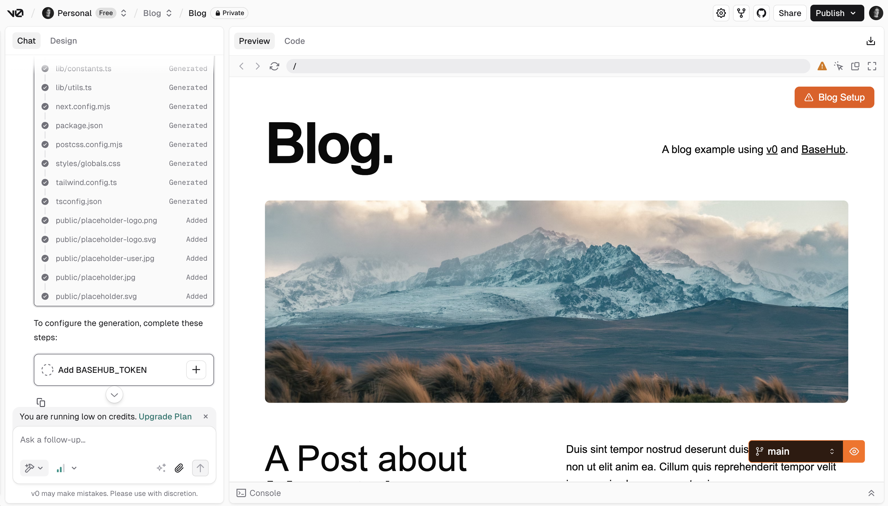
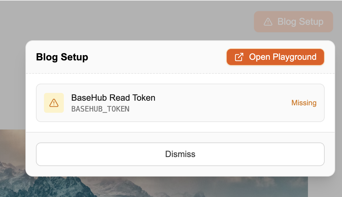
To set this up, we do the following. In basehub.config.ts (this file could be named differently, it doesn’t matter), we call setGlobalConfig with fallbackPlayground.
import { setGlobalConfig } from "basehub"

const _vercel_url_env = "VERCEL_URL"
let v0Id = process.env[_vercel_url_env]
if (v0Id && v0Id.includes("vusercontent")) {
  v0Id = v0Id.split(".")[0]
}

const playgroundId = `${
  v0Id ? encodeURIComponent(v0Id) : "__dev"
}__rel_v0`

setGlobalConfig({
  fallbackPlayground: playgroundId
    ? { target: "basehub/nextjs-blog", id: playgroundId }
    : undefined,
})
The “fallbackPlayground” part is the critical part here (everything else is part of the v0 example itself): it tells our API, “if you don’t find a token in the request headers (cause the request is unauthenticated), fallback to a playground with this id”.
Then, you can render the “Open in playground” link to visitors by querying the playground info:
const playgroundData = await basehub().query({
  _sys: {
    playgroundInfo: {
      expiresAt: true,
      editUrl: true,
      claimUrl: true,
    },
  },
})

if (playgroundData._sys.playgroundInfo) {
  playgroundNotification = (
    <a href={playgroundInfo.editUrl} target="_blank">
      Open Playground
    </a>
  )
}
And, that’s really it.
Bonus: “Rel” attribute
If you’re planning to put this in v0, you’ll want to suffix your playground IDs with __rel_v0, as we’ll pick that “rel” up and after visitors claim the repository, we’ll show a nice “Coming from v0?” callout to streamline onboarding.
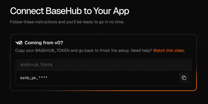
Marketing Website Template
The perfect way to start your next marketing website.
BaseHub Repo: https://basehub.com/basehub/marketing-website
GitHub Repo: https://github.com/basehub-ai/marketing-website-template

This template is great for:
SaaS companies
AI startups
Indie hackers
… and more!
Once you fork and deploy the template, you’ll own the code and the content. You’ll be able to edit all of its copy, change the logo and accent color, and add new sections and programmatic pages.
Documentation Template
The template that powers this documentation website.
BaseHub Repo: https://basehub.com/basehub/docs
GitHub Repo: https://github.com/basehub-ai/docs-template
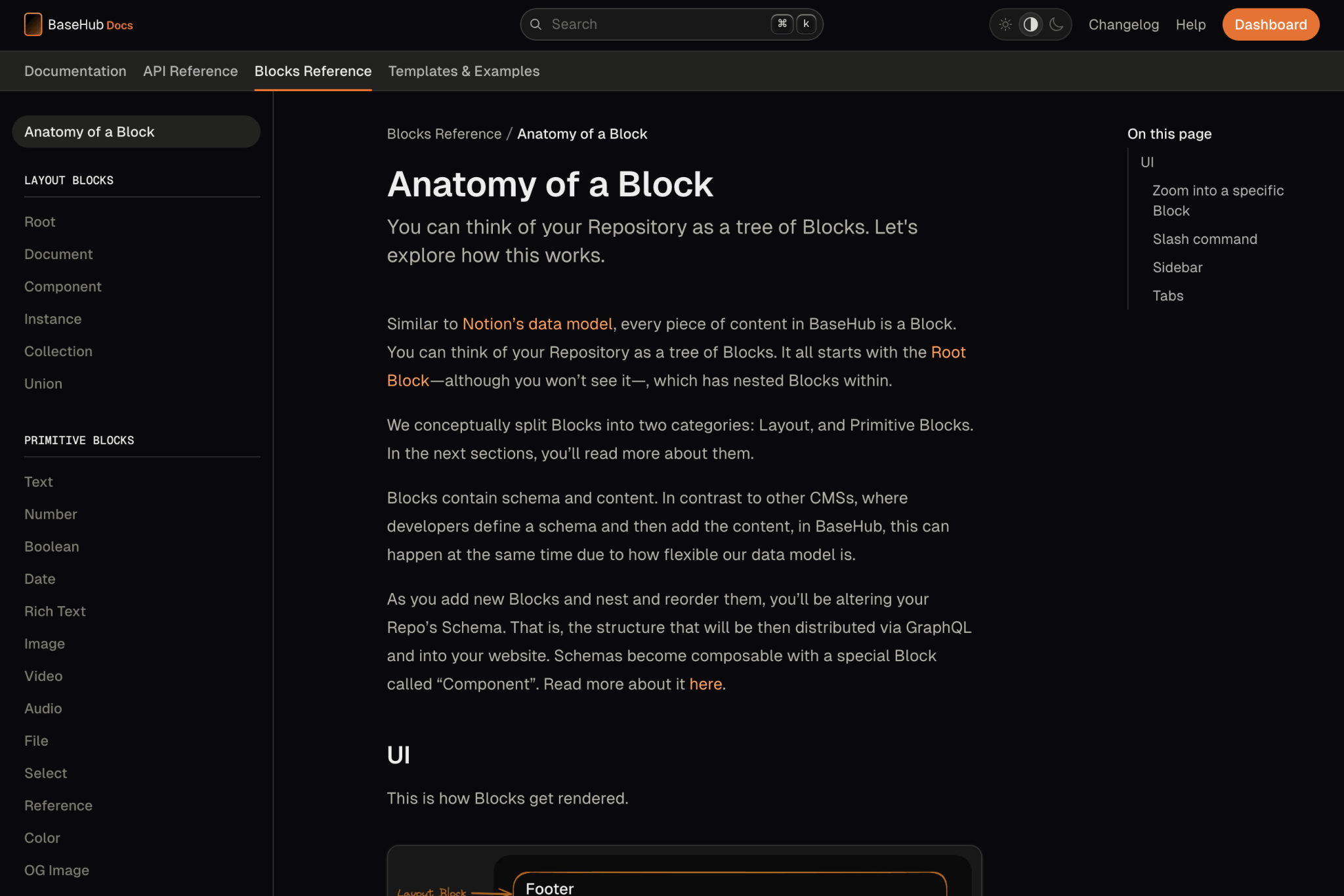
This template is great for:
Developer Docs
Company Handbooks
User Manuals
… and more!
Once you fork and deploy the template, you’ll own the code and the content. You’ll be able to edit all of its copy, change the logo and accent color, and add new sections and articles.
Help Center Template
The template that powers our own Help Center. Full-text search included.
BaseHub Repo: https://basehub.com/basehub/help-center
GitHub Repo: https://github.com/basehub-ai/help-center-template
This template is great for:
Help Centers
FAQs and Knowledge Bases
… and more!
Once you fork and deploy the template, you’ll own the code and the content. You’ll be able to edit all of its copy, change the logo and accent color, and add new sections and articles.
Waitlist Template
Minim ipsum veniam elit duis veniam consectetur sit.
BaseHub Repo: https://basehub.com/basehub/waitlist-template
GitHub Repo: https://github.com/basehub-ai/nextjs-waitlist
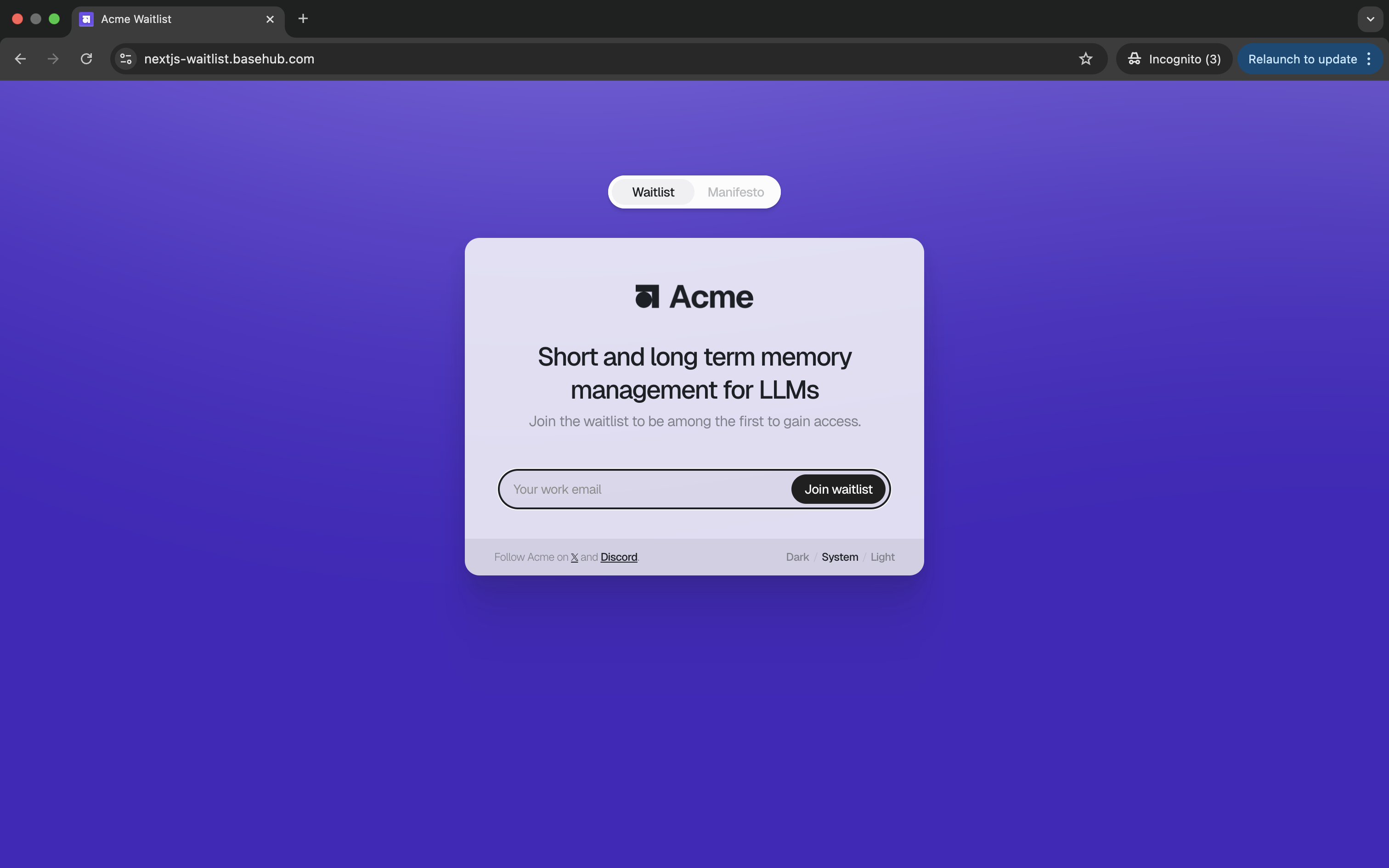
Create a Feedback Form
A simple "Feedback" form using the Event and the Workflow Blocks.
This example covers: creating the Event Block, hooking it up with the Next.js App, as well as listening for new submissions and posting them to a Discord Channel via a Workflow Block.
Create a Newsletter
See how you can build a fully-fledged Newsletter using the Event and Workflow Blocks, plus Resend and React Email.
By pairing a couple of BaseHub Blocks, you can add a newsletter to your website easily. Take a look at the Marketing Website Template for a good starting point.
Create a View Counter
Track page views with the Event Block, and display them in your site.
Create a Form Builder
Programmatic pages and forms using the Reference and Event Blocks.
This is how the Marketing Website Template works—you should check it out!
Custom Components in Rich Text
Learn how to use custom components within rich text blocks.
Custom components in rich text allows you to extend beyond the basic rich text nodes. This can enable you to embed things like:
Tweets
Interactive code blocks
Callouts, or any other thing you can imagine…
In this guide, we’ll walk you through creating a component that fits your need, all the way to rendering it in your website.
Create the component1
To create a new component, we’ll go to somewhere in our editor and write /component. We’ll give it a name, and add some data into it.
In this case, we’ll create a “Tweet” component, we’ll add an ID block (required), and therefore Hide this component (to skip the “required” validation. Learn more).
Create a Rich Text block, and add our new component to “Component types”2
Next, we’ll create a rich text block. You’d typically have this within a collection, but you can also drop it inside a regular document.
In this video, we also go ahead and add a tweet id for the tweet we want to embed.
Set up the code environment3
Let’s get BaseHub connected to a new Next.js App.
pnpm create next-appWe install basehub:
pnpm install basehubNow, we add the basehub scripts so the codegen runs before next dev and next build. In package.json:
  "scripts": {
    "dev": "basehub dev & next dev --turbopack",
    "build": "basehub && next build",
    "start": "next start",
    "lint": "next lint"
},Note: this snippet includes just package.json > scripts; you should keep the rest of the file as is.
We then add our BASEHUB_TOKEN to .env.local:
BASEHUB_TOKEN="<grab-this-from-your-dash>"And finally, we run the dev server:
pnpm run devQuery the rich text block, using blocks 4
Let’s now create our first query, using Pump, to get the content in our Rich Text. Over in app/page.tsx, let’s replace everything with the following:
import { Pump } from "basehub/react-pump";

export default function Home() {
  return (
    <Pump
      queries={[
        {
          indexPage: {
            title: {
              json: {
                content: true,
                blocks: {
                  on_BlockDocument: {
                    __typename: true,
                    _id: true,
                  },
                  on_TweetComponent: {
                    id: true,
                  },
                },
              },
            },
          },
        },
      ]}
    >
      {async ([{ indexPage }]) => {
        "use server";
        return <pre>{JSON.stringify(indexPage, null, 2)}</pre>;
      }}
    </Pump>
  );
}
Now, when navigating to http://localhost:3000, you should see this in your screen:

Render it using <RichText /> 5
Let’s now use the <RichText /> react component to handle our Tweet component. We import the component:
import { RichText } from 'basehub/react-rich-text'And use it:
async ([{ indexPage }]) => {
  "use server"
  return (
    <RichText
      content={indexPage.title.json.content}
      blocks={indexPage.title.json.blocks}
      components={{
        TweetComponent: ({ id }) => {
          return <div>Render tweet: {id}</div>
        },
      }}
    />
  )
}
All together, that file now looks like this:
import { Pump } from "basehub/react-pump";
import { RichText } from "basehub/react-rich-text";

export default function Home() {
  return (
    <Pump
      queries={[
        {
          indexPage: {
            title: {
              json: {
                content: true,
                blocks: {
                  on_BlockDocument: {
                    __typename: true,
                    _id: true,
                  },
                  on_TweetComponent: {
                    id: true,
                  },
                },
              },
            },
          },
        },
      ]}
    >
      {async ([{ indexPage }]) => {
        "use server";
        return (
          <RichText
            content={indexPage.title.json.content}
            blocks={indexPage.title.json.blocks}
            components={{
              TweetComponent: ({ id }) => {
                return <div>Render tweet: {id}</div>;
              },
            }}
          />
        );
      }}
    </Pump>
  );
}
Bonus: use react-tweet to render the tweet6
Up until this point, you can already handle your own custom logic within those components. In our case, we’ll install react-tweet to render our tweet.
pnpm i react-tweetAnd then adjust some things:
import { Tweet } from "react-tweet"

// the rest stays as is

TweetComponent: ({ id }) => {
  return <Tweet id={id} />
}
And the result is:

Not the prettiest, but a good foundation to build powerful rich texts!
Wrapping Up
That’s all for this guide! Let us know if you have any questions or suggestions in our Help Center.
Simple A/B Testing
Learn how to perform simple A/B tests with BaseHub and the Variant Block.


